import torch
import numpy as np
import matplotlib.pyplot as plt
import pandas as pd
import matplotlib.pyplot as plt
%matplotlib inline
# Retina display
%config InlineBackend.figure_format = 'retina'CIFAR10 and CIFAR100 dataset
https://www.cs.toronto.edu/~kriz/cifar.html
Ref: https://hjweide.github.io/quantifying-uncertainty-in-neural-networks
- Red objects: cars or apples?
- Green objects: frogs? or apples?

Reference slides
https://classifier-calibration.github.io/assets/slides/clacal_tutorial_ecmlpkdd_2020_intro.pdf
First 7 slides from above link
from tueplots import bundles
plt.rcParams.update(bundles.beamer_moml())


# Also add despine to the bundle using rcParams
plt.rcParams['axes.spines.right'] = False
plt.rcParams['axes.spines.top'] = False

# Increase font size to match Beamer template
plt.rcParams['font.size'] = 16
# Make background transparent
plt.rcParams['figure.facecolor'] = 'none'
from sklearn.datasets import make_moons
from sklearn.linear_model import LogisticRegression
X, y = make_moons(n_samples=1000, noise=0.1, random_state=0)
clf = LogisticRegression()
clf.fit(X, y)LogisticRegression()p_hats = clf.predict_proba(X)[:, 1]
p_hats[:10]array([0.60804417, 0.96671272, 0.02867904, 0.41138351, 0.9631718 ,
0.72298419, 0.51086972, 0.0148838 , 0.01696895, 0.98714042])true_labels = y
true_labels[:10]array([1, 1, 0, 1, 1, 1, 0, 0, 0, 1])df = pd.DataFrame({'p_hat': p_hats, 'y': true_labels})
df.head()| p_hat | y | |
|---|---|---|
| 0 | 0.608044 | 1 |
| 1 | 0.966713 | 1 |
| 2 | 0.028679 | 0 |
| 3 | 0.411384 | 1 |
| 4 | 0.963172 | 1 |
# Let us look at samples where p_hat is close to 0.5 (say between 0.45 and 0.55)
df_close_phat_val = df[(df.p_hat > 0.45) & (df.p_hat < 0.55)]
df_close_phat_val.head()| p_hat | y | |
|---|---|---|
| 6 | 0.510870 | 0 |
| 15 | 0.481702 | 0 |
| 20 | 0.533697 | 0 |
| 41 | 0.522857 | 1 |
| 60 | 0.483962 | 1 |
len(df_close_phat_val)31# Histogram of p_hat values
df.p_hat.hist(bins=50)
plt.xlabel('$\hat{p}$')
plt.ylabel('Frequency')
plt.title('Histogram of $\hat{p}$ values');findfont: Font family ['cursive'] not found. Falling back to DejaVu Sans.
findfont: Generic family 'cursive' not found because none of the following families were found: Apple Chancery, Textile, Zapf Chancery, Sand, Script MT, Felipa, Comic Neue, Comic Sans MS, cursive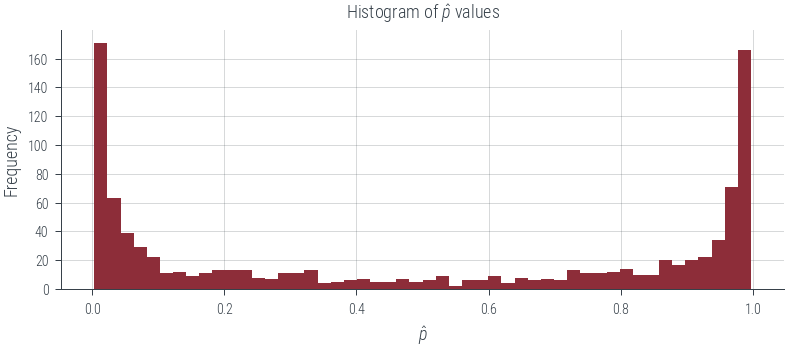
# Out of these len(df_close_phat_val) samples, how many are actually positive?

df_close_phat_val.y.sum()18# Fraction of positive samples
df_close_phat_val.y.sum() / len(df_close_phat_val)0.5806451612903226# This is the reliability of the classifier at p_hat = 0.5bins = np.linspace(0, 1, 11)
binsarray([0. , 0.1, 0.2, 0.3, 0.4, 0.5, 0.6, 0.7, 0.8, 0.9, 1. ])# Let us add a column to the dataframe that tells us which bin each sample belongs to
df['bin'] = pd.cut(df.p_hat, bins=bins)
df.head()| p_hat | y | bin | |
|---|---|---|---|
| 0 | 0.608044 | 1 | (0.6, 0.7] |
| 1 | 0.966713 | 1 | (0.9, 1.0] |
| 2 | 0.028679 | 0 | (0.0, 0.1] |
| 3 | 0.411384 | 1 | (0.4, 0.5] |
| 4 | 0.963172 | 1 | (0.9, 1.0] |
# Let us compute the reliability of the classifier in each bin

df.groupby('bin').y.mean()
bin
(0.0, 0.1] 0.006231
(0.1, 0.2] 0.241379
(0.2, 0.3] 0.269231
(0.3, 0.4] 0.375000
(0.4, 0.5] 0.620690
(0.5, 0.6] 0.413793
(0.6, 0.7] 0.529412
(0.7, 0.8] 0.722222
(0.8, 0.9] 0.849315
(0.9, 1.0] 0.987097
Name: y, dtype: float64# Calculate the reliability diagram points
mean_predicted_probs = df.groupby('bin').p_hat.mean()
fraction_of_positives = df.groupby('bin').y.mean()bin_sizes = df.groupby('bin').size()
bin_sizesbin
(0.0, 0.1] 321
(0.1, 0.2] 58
(0.2, 0.3] 52
(0.3, 0.4] 40
(0.4, 0.5] 29
(0.5, 0.6] 29
(0.6, 0.7] 34
(0.7, 0.8] 54
(0.8, 0.9] 73
(0.9, 1.0] 310
dtype: int64ece = (np.abs(mean_predicted_probs - fraction_of_positives) * bin_sizes / len(df)).sum()
ece0.036133146181597894plt.figure(figsize=(6, 6))
plt.plot([0, 1], [0, 1], 'k:')
plt.plot(mean_predicted_probs, fraction_of_positives, 'o-')
plt.xlabel('Predicted probability')
plt.ylabel('Fraction of positives')
plt.title(f'Reliability Diagram (ECE={ece:.4f})')
plt.gca().set_aspect('equal')
# Plot the bar also
plt.bar(mean_predicted_probs, fraction_of_positives, width=0.1, alpha=0.1)<BarContainer object of 10 artists>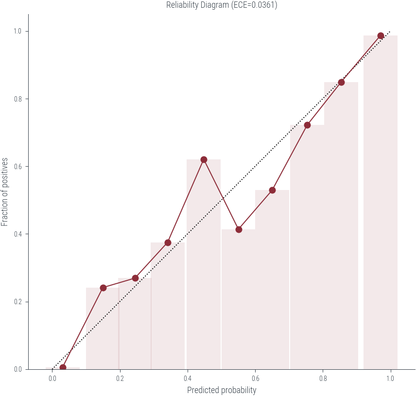
from sklearn.calibration import calibration_curve

prob_true, prob_pred = calibration_curve(df['y'], df['p_hat'], n_bins=10, strategy='uniform')
assert np.allclose(prob_true, fraction_of_positives)assert np.allclose(prob_pred, mean_predicted_probs)pd.DataFrame({'prob_true': prob_true, 'prob_pred': prob_pred})| prob_true | prob_pred | |
|---|---|---|
| 0 | 0.006231 | 0.030912 |
| 1 | 0.241379 | 0.149753 |
| 2 | 0.269231 | 0.244433 |
| 3 | 0.375000 | 0.341098 |
| 4 | 0.620690 | 0.447832 |
| 5 | 0.413793 | 0.550410 |
| 6 | 0.529412 | 0.650223 |
| 7 | 0.722222 | 0.753892 |
| 8 | 0.849315 | 0.854304 |
| 9 | 0.987097 | 0.970665 |
import numpy as np
import pandas as pd
import matplotlib.pyplot as plt
from sklearn.calibration import calibration_curve

def plot_reliability_diagram(classifier, X, y, n_bins=10, ax=None):
    """
    Generate a reliability diagram and calculate ECE for a classifier.

    Parameters:
    - classifier: A scikit-learn classifier with a `predict_proba` method.
    - X: Input features for the dataset.
    - y: True labels for the dataset.
    - n_bins: Number of bins for the reliability diagram.
    - ax: Matplotlib axes object to plot on.

    Returns:
    - ece: Expected Calibration Error (ECE).
    """
    if ax is None:
        fig, ax = plt.subplots()

    # Fit the classifier
    classifier.fit(X, y)

    # Predict probabilities
    p_hats = classifier.predict_proba(X)[:, 1]

    # Create a DataFrame
    df = pd.DataFrame({'p_hat': p_hats, 'y': y})

    # Create bins based on predicted probabilities
    bins = np.linspace(0, 1, n_bins + 1)
    df['bin'] = pd.cut(df['p_hat'], bins=bins)

    mean_predicted_probs = df.groupby('bin').p_hat.mean()
    fraction_of_positives = df.groupby('bin').y.mean()

    # Fill NANs with 0
    mean_predicted_probs = mean_predicted_probs.fillna(0)
    fraction_of_positives = fraction_of_positives.fillna(0)

    # Calculate the Expected Calibration Error (ECE) weighted by bin sizes
    bin_sizes = df.groupby('bin').size()

    # Ensure bin_sizes align with prob_true and prob_pred
    #bin_sizes = bin_sizes.reindex(range(n_bins), fill_value=0)
    #return bin_sizes, mean_predicted_probs, fraction_of_positives

    ece = (np.abs(mean_predicted_probs - fraction_of_positives) * bin_sizes / bin_sizes.sum()).sum()

    # Create the reliability diagram plot
    #plt.figure(figsize=(6, 6))
    ax.plot([0, 1], [0, 1], 'k:')
    ax.scatter(mean_predicted_probs, fraction_of_positives)
    # Plot bar also
    ax.bar(mean_predicted_probs, fraction_of_positives, width=0.1, alpha=0.1)
    ax.set_xlabel('Mean Predicted Probability')
    ax.set_ylabel('Fraction of Positives')
    ax.set_title(f'Calibration Curve (ECE={ece:.4f})')
    #plt.gca().set_aspect('equal')
    return ece
from sklearn.ensemble import RandomForestClassifier
from sklearn.svm import SVC
from sklearn.neighbors import KNeighborsClassifier
from sklearn.calibration import CalibrationDisplay
# Generate the dataset
X, y = make_moons(n_samples=1000, noise=0.1, random_state=0)
# List of classifiers to evaluate
classifiers = [
('Logistic Regression', LogisticRegression()),
('Random Forest', RandomForestClassifier(n_estimators=100, random_state=0)),
('Support Vector Classifier', SVC(probability=True)),
('K-Nearest Neighbors', KNeighborsClassifier(n_neighbors=3))
]
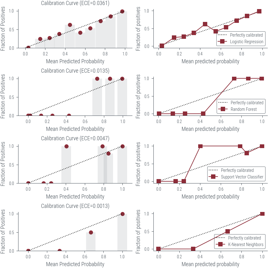
fig, axarr = plt.subplots(figsize=(6, 6), nrows=len(classifiers), ncols=2)
# Loop through the classifiers and generate reliability diagrams
for i, (name, classifier) in enumerate(classifiers):
ece = plot_reliability_diagram(classifier, X, y, ax=axarr[i, 0])
print(f"Classifier: {name}")
print(f"ECE: {ece:.4f}")
CalibrationDisplay.from_estimator(
classifier,
X,
y,
n_bins=10,
ax = axarr[i, 1],
name=name
)
print("*"*20)
print("*"*20)
print("\n" + "=" * 50 + "\n")Classifier: Logistic Regression
ECE: 0.0361
********************
********************
==================================================
Classifier: Random Forest
ECE: 0.0135
********************
********************
==================================================
Classifier: Support Vector Classifier
ECE: 0.0047
********************
********************
==================================================
Classifier: K-Nearest Neighbors
ECE: 0.0013
********************
********************
==================================================
Multiclass reliability diagram
Slide 26 from https://classifier-calibration.github.io/assets/slides/clacal_tutorial_ecmlpkdd_2020_intro.pdf
# Now, multi-class classification and reliability diagrams

from sklearn.datasets import make_classification, make_blobs

X, y = make_blobs(n_samples=1000, centers=3, n_features=2, random_state=0)

# Plot the dataset
plt.scatter(X[:, 0], X[:, 1], c=y, cmap='viridis')
<matplotlib.collections.PathCollection at 0x7f33e5367eb0>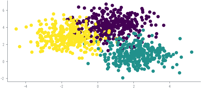
clf = LogisticRegression()
clf.fit(X, y)LogisticRegression()preds = pd.DataFrame(clf.predict_proba(X))preds| 0 | 1 | 2 | |
|---|---|---|---|
| 0 | 0.068741 | 0.005454 | 0.925805 |
| 1 | 0.983384 | 0.015859 | 0.000757 |
| 2 | 0.021072 | 0.000240 | 0.978688 |
| 3 | 0.042703 | 0.001372 | 0.955925 |
| 4 | 0.000208 | 0.000026 | 0.999766 |
| ... | ... | ... | ... |
| 995 | 0.005001 | 0.994489 | 0.000510 |
| 996 | 0.050768 | 0.015765 | 0.933467 |
| 997 | 0.006151 | 0.911409 | 0.082440 |
| 998 | 0.000271 | 0.000021 | 0.999708 |
| 999 | 0.021539 | 0.962650 | 0.015811 |
1000 rows × 3 columns
preds['y'] = ypreds.head(10)| 0 | 1 | 2 | y | |
|---|---|---|---|---|
| 0 | 0.068741 | 0.005454 | 0.925805 | 2 |
| 1 | 0.983384 | 0.015859 | 0.000757 | 0 |
| 2 | 0.021072 | 0.000240 | 0.978688 | 2 |
| 3 | 0.042703 | 0.001372 | 0.955925 | 2 |
| 4 | 0.000208 | 0.000026 | 0.999766 | 2 |
| 5 | 0.179771 | 0.797045 | 0.023183 | 1 |
| 6 | 0.120874 | 0.003821 | 0.875305 | 0 |
| 7 | 0.957242 | 0.000002 | 0.042756 | 0 |
| 8 | 0.000908 | 0.998876 | 0.000216 | 1 |
| 9 | 0.836772 | 0.162509 | 0.000718 | 0 |
# Syntax highlighting to show highest amongst the three columns
most_probable_class = preds[[0, 1, 2]].idxmax(axis=1)

# Add the most probable class to the DataFrame
preds['y_hat'] = most_probable_classpreds.head()| 0 | 1 | 2 | y | y_hat | |
|---|---|---|---|---|---|
| 0 | 0.068741 | 0.005454 | 0.925805 | 2 | 2 |
| 1 | 0.983384 | 0.015859 | 0.000757 | 0 | 0 |
| 2 | 0.021072 | 0.000240 | 0.978688 | 2 | 2 |
| 3 | 0.042703 | 0.001372 | 0.955925 | 2 | 2 |
| 4 | 0.000208 | 0.000026 | 0.999766 | 2 | 2 |
# Let us simplify dataframe to only include the most probable class probability and whether the prediction was correct or not
new_df = preds.copy()
new_df["Correct"] = new_df.y == new_df.y_hat
new_df["Most_Probable_Class_Probability"] = new_df[[0, 1, 2]].max(axis=1)

new_df.head()| 0 | 1 | 2 | y | y_hat | Correct | Most_Probable_Class_Probability | |
|---|---|---|---|---|---|---|---|
| 0 | 0.068741 | 0.005454 | 0.925805 | 2 | 2 | True | 0.925805 |
| 1 | 0.983384 | 0.015859 | 0.000757 | 0 | 0 | True | 0.983384 |
| 2 | 0.021072 | 0.000240 | 0.978688 | 2 | 2 | True | 0.978688 |
| 3 | 0.042703 | 0.001372 | 0.955925 | 2 | 2 | True | 0.955925 |
| 4 | 0.000208 | 0.000026 | 0.999766 | 2 | 2 | True | 0.999766 |
# drop the other columns
new_df = new_df.drop(columns=[0, 1, 2, 'y', 'y_hat'])
new_df.head()| Correct | Most_Probable_Class_Probability | |
|---|---|---|
| 0 | True | 0.925805 |
| 1 | True | 0.983384 |
| 2 | True | 0.978688 |
| 3 | True | 0.955925 |
| 4 | True | 0.999766 |
# Let us look at samples where the most probable class probability is close to 0.5 (say between 0.45 and 0.55)
df_close_phat_val = new_df[(new_df.Most_Probable_Class_Probability > 0.45) & (new_df.Most_Probable_Class_Probability < 0.55)]
df_close_phat_val.head()| Correct | Most_Probable_Class_Probability | |
|---|---|---|
| 27 | True | 0.532492 |
| 127 | False | 0.537886 |
| 135 | True | 0.536489 |
| 171 | True | 0.512435 |
| 203 | False | 0.534704 |
df_close_phat_val.Correct.sum() / len(df_close_phat_val)0.4838709677419355# Now, let us compute the reliability of the classifier in each bin
bins = np.linspace(0, 1, 11)
# Cuts the data by the bins
new_df['bin'] = pd.cut(new_df.Most_Probable_Class_Probability, bins=bins)new_df.head(10)| Correct | Most_Probable_Class_Probability | bin | |
|---|---|---|---|
| 0 | True | 0.925805 | (0.9, 1.0] |
| 1 | True | 0.983384 | (0.9, 1.0] |
| 2 | True | 0.978688 | (0.9, 1.0] |
| 3 | True | 0.955925 | (0.9, 1.0] |
| 4 | True | 0.999766 | (0.9, 1.0] |
| 5 | True | 0.797045 | (0.7, 0.8] |
| 6 | False | 0.875305 | (0.8, 0.9] |
| 7 | True | 0.957242 | (0.9, 1.0] |
| 8 | True | 0.998876 | (0.9, 1.0] |
| 9 | True | 0.836772 | (0.8, 0.9] |
# Calculate the reliability diagram points
mean_predicted_probs = new_df.groupby('bin').Most_Probable_Class_Probability.mean()
fraction_of_positives = new_df.groupby('bin').Correct.mean()

bin_sizes = new_df.groupby('bin').size()

ece = (np.abs(mean_predicted_probs - fraction_of_positives) * bin_sizes / len(new_df)).sum()ece0.016551445751129316# Plot the reliability diagram
plt.figure(figsize=(6, 6))
plt.plot([0, 1], [0, 1], 'k:')
plt.plot(mean_predicted_probs, fraction_of_positives, 'o-')
plt.xlabel('Predicted probability')
plt.ylabel('Fraction of positives')
plt.title(f'Reliability Diagram (ECE={ece:.4f})')Text(0.5, 1.0, 'Reliability Diagram (ECE=0.0166)')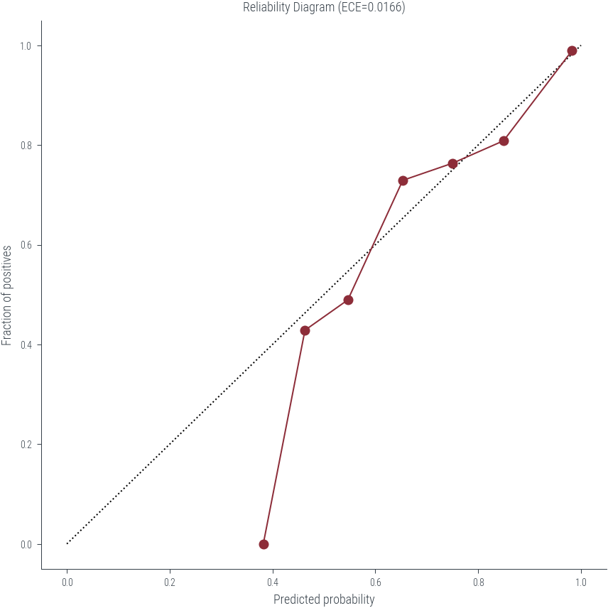
# Histogram of p_hat values

new_df.Most_Probable_Class_Probability.hist(bins=50)
plt.xlim(0, 1)
(0.0, 1.0)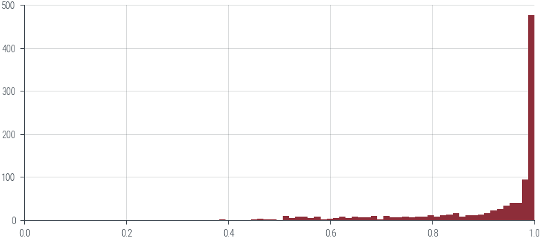
Reliability Diagrams for regression
https://proceedings.mlr.press/v80/kuleshov18a/kuleshov18a.pdf
# Now let us look at the above for regression with heteroscedastic aleatoric uncertainty

X = np.linspace(-3, 3, 1000).reshape(-1, 1)
y = np.sin(X.flatten()) + np.random.normal(0, 0.1, X.shape[0])

plt.scatter(X, y, s=10, alpha=0.5)
<matplotlib.collections.PathCollection at 0x7f351983e700>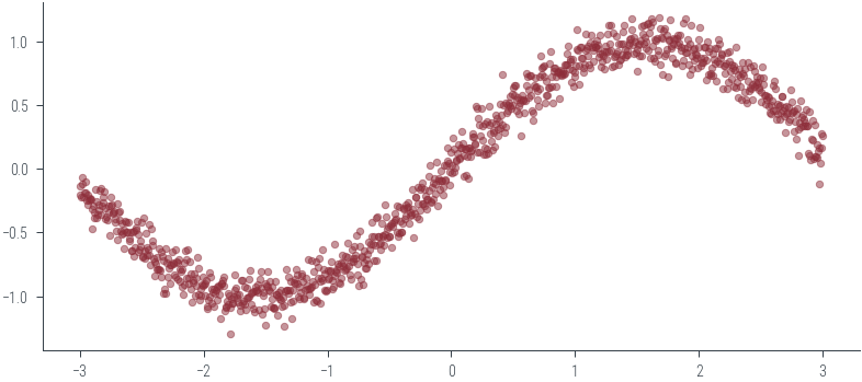
# Use BayesianRidge for regression
from sklearn.linear_model import BayesianRidge

reg = BayesianRidge()
reg.fit(X, y)BayesianRidge()# Predict on linspace
X_test = np.linspace(-3, 3, 100).reshape(-1, 1)
y_pred, y_std = reg.predict(X_test, return_std=True)
# Plot the predictions
plt.plot(X_test, y_pred)
plt.fill_between(X_test.flatten(), y_pred - y_std, y_pred + y_std, alpha=0.5)
plt.scatter(X, y, alpha=0.1)<matplotlib.collections.PathCollection at 0x7f350eb599a0>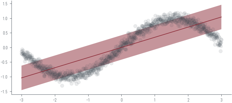
# Within 1\sigma we would like to see 68% of the data points
# Within 2\sigma we would like to see 95% of the data points

# Let us see how many points are within k*sigma of the mean
k = 1
y_pred, y_std = reg.predict(X, return_std=True)
# Check how many points are within k*sigma of the mean
within_k_sigma = np.abs(y - y_pred) < k * y_std
# Fraction of points within k*sigma of the mean
within_k_sigma.mean()0.585def within_k_sigma(y, y_pred, y_std, k=1):
"""
Return the fraction of points within k*sigma of the mean.
"""
return np.abs(y - y_pred) < k * y_std# Plot within_k_sigma for k=1, 2, 3, ..
ks = np.arange(1, 6)
within_k_sigma_fractions = [within_k_sigma(y, y_pred, y_std, k=k).mean() for k in ks]
plt.plot(ks, within_k_sigma_fractions, 'o-')
plt.xlabel('k')
plt.ylabel('Fraction of points within k*sigma of the mean')Text(0, 0.5, 'Fraction of points within k*sigma of the mean')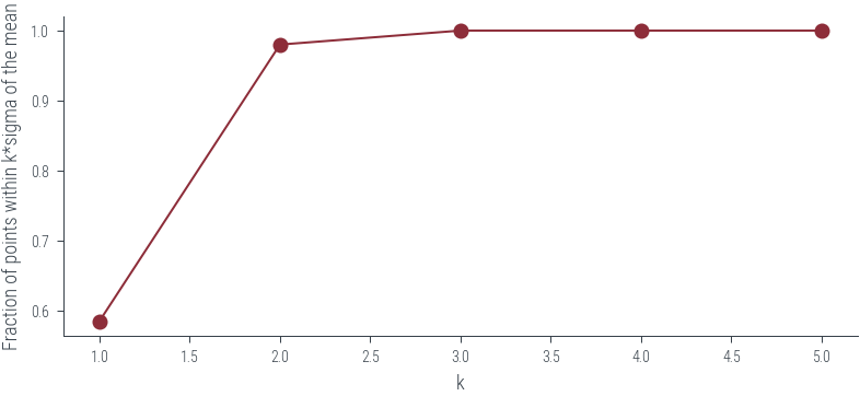
# but, ideally we want 95% of the points to be within 2*sigma of the mean or within 95% CI
# we need a function to map CI to k

from scipy.stats import norm

def ci_to_k(ci):
    """
    Return the value of k corresponding to the given confidence interval.
    """
return norm.ppf((1 + ci) / 2)ci_to_k(0.95)1.959963984540054ci_to_k(0.68)0.9944578832097535# make reliability diagram for regression
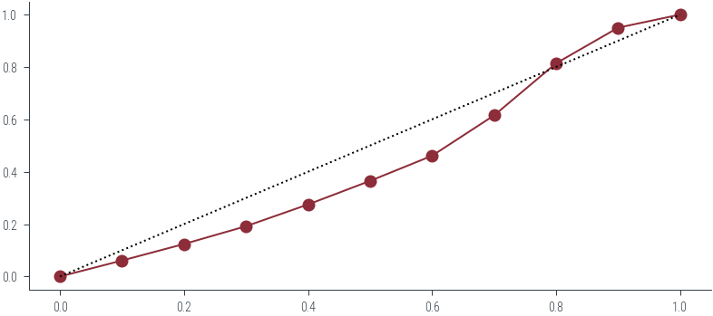
percentiles = np.linspace(0, 100, 11)
quantiles = percentiles / 100
ks = ci_to_k(quantiles)
# Get fraction of points within k*sigma of the mean for each k
within_k_sigma_fractions = [within_k_sigma(y, y_pred, y_std, k=k).mean() for k in ks]
plt.plot(quantiles, within_k_sigma_fractions, 'o-')
# Plot ideal
plt.plot([0, 1], [0, 1], 'k:')