Code
import pandas as pd
import matplotlib.pyplot as plt
plt.style.use('ggplot')
%matplotlib inlineWe’ve all grown up studying groupy by and aggregations in SQL. Pandas provides excellent functionality for group by and aggregations. However, for time series data, we need a bit of manipulation. In this post, I’ll take a small example of weather time series data.
import pandas as pd
import matplotlib.pyplot as plt
plt.style.use('ggplot')
%matplotlib inlinedf = pd.read_csv("weather.csv", index_col=0, parse_dates=True).tz_localize("UTC").tz_convert("US/Central")df.head()| humidity | temperature | |
|---|---|---|
| 2015-01-01 00:00:00-06:00 | 0.73 | 38.74 |
| 2015-01-01 01:00:00-06:00 | 0.74 | 38.56 |
| 2015-01-01 02:00:00-06:00 | 0.75 | 38.56 |
| 2015-01-01 03:00:00-06:00 | 0.79 | 37.97 |
| 2015-01-01 04:00:00-06:00 | 0.80 | 37.78 |
We’ll create a new column in the df containing the hour information from the index.
df["hour"] = df.index.hourdf.head()| humidity | temperature | hour | |
|---|---|---|---|
| 2015-01-01 00:00:00-06:00 | 0.73 | 38.74 | 0 |
| 2015-01-01 01:00:00-06:00 | 0.74 | 38.56 | 1 |
| 2015-01-01 02:00:00-06:00 | 0.75 | 38.56 | 2 |
| 2015-01-01 03:00:00-06:00 | 0.79 | 37.97 | 3 |
| 2015-01-01 04:00:00-06:00 | 0.80 | 37.78 | 4 |
mean_temp_humidity = df.groupby("hour").mean()
mean_temp_humidity.head()| humidity | temperature | |
|---|---|---|
| hour | ||
| 0 | 0.779322 | 45.976441 |
| 1 | 0.803898 | 44.859492 |
| 2 | 0.812203 | 44.244407 |
| 3 | 0.819153 | 43.724068 |
| 4 | 0.832712 | 43.105763 |
mean_temp_humidity.plot(subplots=True);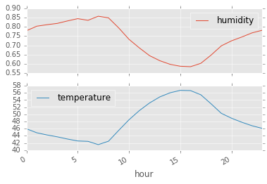
We can use pivoting to achieve the same dataframe.
mean_temp_humidity_pivoting = pd.pivot_table(df, index=["hour"], values=["temperature", "humidity"])mean_temp_humidity_pivoting.head()| humidity | temperature | |
|---|---|---|
| hour | ||
| 0 | 0.779322 | 45.976441 |
| 1 | 0.803898 | 44.859492 |
| 2 | 0.812203 | 44.244407 |
| 3 | 0.819153 | 43.724068 |
| 4 | 0.832712 | 43.105763 |
By default the aggregation function used in pivoting is mean.
For this, we want to have a dataframe with hour of day as the index and the different days as the different columns.
df["day"] = df.index.dayofyeardf.head()| humidity | temperature | hour | day | |
|---|---|---|---|---|
| 2015-01-01 00:00:00-06:00 | 0.73 | 38.74 | 0 | 1 |
| 2015-01-01 01:00:00-06:00 | 0.74 | 38.56 | 1 | 1 |
| 2015-01-01 02:00:00-06:00 | 0.75 | 38.56 | 2 | 1 |
| 2015-01-01 03:00:00-06:00 | 0.79 | 37.97 | 3 | 1 |
| 2015-01-01 04:00:00-06:00 | 0.80 | 37.78 | 4 | 1 |
daily_temp = pd.pivot_table(df, index=["hour"], columns=["day"], values=["temperature"])daily_temp.head()| temperature | |||||||||||||||||||||
|---|---|---|---|---|---|---|---|---|---|---|---|---|---|---|---|---|---|---|---|---|---|
| day | 1 | 2 | 3 | 4 | 5 | 6 | 7 | 8 | 9 | 10 | ... | 50 | 51 | 52 | 53 | 54 | 55 | 56 | 57 | 58 | 59 |
| hour | |||||||||||||||||||||
| 0 | 38.74 | 39.94 | 39.57 | 41.83 | 33.95 | 36.98 | 46.93 | 29.95 | 36.57 | 36.19 | ... | 46.17 | 54.01 | 66.57 | 55.49 | 37.68 | 30.34 | 34.97 | 39.93 | 36.19 | 32.25 |
| 1 | 38.56 | 39.76 | 39.75 | 40.85 | 32.29 | 35.89 | 45.33 | 28.55 | 37.31 | 36.40 | ... | 41.38 | 54.56 | 66.57 | 55.49 | 36.76 | 30.04 | 34.97 | 36.37 | 36.38 | 32.25 |
| 2 | 38.56 | 39.58 | 39.94 | 39.73 | 31.59 | 36.44 | 44.51 | 27.44 | 37.78 | 36.59 | ... | 39.99 | 55.81 | 66.57 | 55.34 | 35.56 | 30.57 | 34.75 | 34.74 | 36.20 | 32.25 |
| 3 | 37.97 | 38.83 | 40.16 | 38.78 | 30.48 | 36.85 | 43.92 | 25.97 | 37.97 | 36.38 | ... | 39.05 | 57.14 | 66.38 | 55.27 | 34.94 | 30.59 | 35.15 | 34.31 | 36.20 | 32.52 |
| 4 | 37.78 | 39.02 | 40.65 | 39.74 | 29.89 | 35.72 | 44.37 | 24.74 | 37.82 | 35.49 | ... | 37.99 | 57.51 | 66.57 | 55.49 | 34.04 | 30.38 | 35.15 | 33.02 | 34.49 | 32.52 |
5 rows × 59 columns
daily_temp.plot(style='k-', alpha=0.3, legend=False)
plt.ylabel("Temp");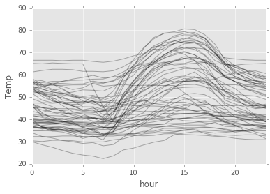
So, we can see some pattern up there! Around 15 hours, the temperature usually peaks.
There you go! Some recipes for aggregation and plotting of time series data.