This blog post is forked from GPSS 2019Lab 1. This is produced only for educational purposes. All credit goes to the GPSS organisers.
Code
# Support for mathsimport numpy as np# Plotting toolsfrom matplotlib import pyplot as plt# we use the following for plotting figures in jupyter%matplotlib inlineimport warningswarnings.filterwarnings('ignore')# GPy: Gaussian processes libraryimport GPyfrom IPython.display import display
Covariance functions, aka kernels
We will define a covariance function, from hereon referred to as a kernel, using GPy. The most commonly used kernel in machine learning is the Gaussian-form radial basis function (RBF) kernel. It is also commonly referred to as the exponentiated quadratic or squared exponential kernel – all are equivalent.
The definition of the (1-dimensional) RBF kernel has a Gaussian-form, defined as:
It has two parameters, described as the variance, \(\sigma^2\) and the lengthscale \(\mathscr{l}\).
In GPy, we define our kernels using the input dimension as the first argument, in the simplest case input_dim=1 for 1-dimensional regression. We can also explicitly define the parameters, but for now we will use the default values:
Code
# Create a 1-D RBF kernel with default parametersk = GPy.kern.RBF(1)# Preview the kernel's parametersk
rbf.
value
constraints
priors
variance
1.0
+ve
lengthscale
1.0
+ve
We can see from the above table that our kernel has two parameters, variance and lengthscale, both with value 1.0. There is also information on the constraints and priors on each parameter, but we will look at this later.
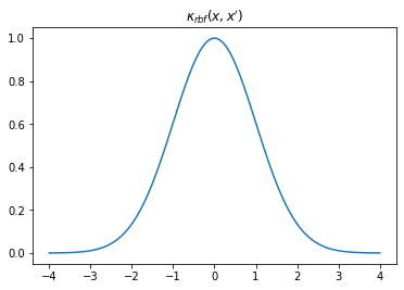
Visualising the kernel
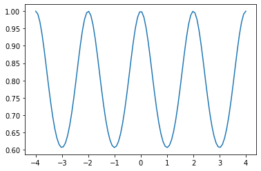
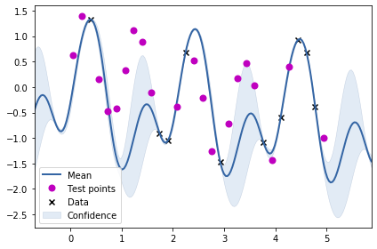
We can visualise our kernel in a few different ways. We can plot the shape of the kernel by plotting \(k(x,0)\) over some sample space \(x\) which, looking at the equation above, clearly has a Gaussian shape. This describes the covariance between each sample location and \(0\).
Code
# Our sample space: 100 samples in the interval [-4,4]X = np.linspace(-4.,4.,100)[:, None] # we need [:, None] to reshape X into a column vector for use in GPy# First, sample kernel at x' = 0K = k.K(X, np.array([[0.]])) # k(x,0)
Code
plt.plot(X, K)plt.title("$\kappa_{rbf}(x,x')$");
Writing an animation function routine for visualsing kernel with changing length scale
Code
fig, ax = plt.subplots()from matplotlib.animation import FuncAnimationfrom matplotlib import rcls = [0.05, 0.25, 0.5, 1., 2., 4.]def update(iteration): ax.cla() k = GPy.kern.RBF(1) k.lengthscale = ls[iteration]# Calculate the new covariance function at k(x,0) C = k.K(X, np.array([[0.]]))# Plot the resulting covariance vector ax.plot(X,C) ax.set_title("$\kappa_{rbf}(x,x')$\nLength scale = %s"%k.lengthscale[0]); ax.set_ylim((0, 1.2))num_iterations =len(ls)anim = FuncAnimation(fig, update, frames=np.arange(0, num_iterations-1, 1), interval=500)plt.close()rc('animation', html='jshtml')anim
From the animation above, we can notice that increasing the scale means that a point becomes more correlated with a further away point. Using such a kernel for GP regression and increasing the length scale would mean making the regression smoother.
Writing an animation function routine for visualsing kernel with changing variance
Code
fig, ax = plt.subplots()import osfrom matplotlib.animation import FuncAnimationfrom matplotlib import rcvariances = [0.01, 0.05, 0.25, 0.5, 1., 2., 4.]def update(iteration): ax.cla() k = GPy.kern.RBF(1) k.variance = variances[iteration]# Calculate the new covariance function at k(x,0) C = k.K(X, np.array([[0.]]))# Plot the resulting covariance vector ax.plot(X,C) ax.set_title("$\kappa_{rbf}(x,x')$\nVariance = %s"%k.variance[0]); ax.set_ylim((0, 2))num_iterations =len(ls)anim = FuncAnimation(fig, update, frames=np.arange(0, num_iterations-1, 1), interval=500)plt.close()rc('animation', html='jshtml')anim
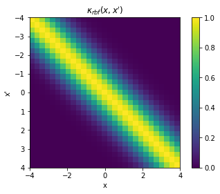
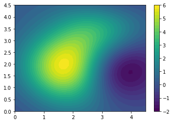
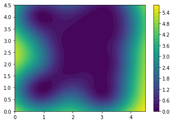
Alternatively, we can construct a full covariance matrix, \(\mathbf{K}_{xx} \triangleq k(x,x')\) with samples \(x = x'\). The resulting GP prior is a multivariate normal distribution over the space of samples \(x\): \(\mathcal{N}(\mathbf{0}, \mathbf{K}_{xx})\). It should be evident then that the elements of the matrix represents the covariance between respective points in \(x\) and \(x'\), and that it is exactly \(\sigma^2[=1]\) in the diagonal.
Code
X = np.linspace(-4.,4.,30)[:, None]K = k.K(X,X)# Plot the covariance of the sample spaceplt.pcolor(X.T, X, K)# Format and annotate plotplt.gca().invert_yaxis(), plt.gca().axis("image")plt.xlabel("x"), plt.ylabel("x'"), plt.colorbar()plt.title("$\kappa_{rbf}(x,x')$");
Code
fig, ax = plt.subplots()cax = fig.add_axes([0.87, 0.2, 0.05, 0.65])def update(iteration): ax.cla() cax.cla() k = GPy.kern.RBF(1) k.lengthscale = ls[iteration]# Calculate the new covariance function at k(x,0) K = k.K(X,X)# Plot the covariance of the sample space im = ax.pcolor(X.T, X, K)# Format and annotate plot ax.invert_yaxis() ax.axis("image")#ax.colorbar()# Plot the resulting covariance vector ax.set_title("Length scale = %s"%k.lengthscale[0]);#ax.set_ylim((0, 1.2)) fig.colorbar(im, cax=cax, orientation='vertical') fig.tight_layout()num_iterations =len(ls)anim = FuncAnimation(fig, update, frames=np.arange(0, num_iterations, 1), interval=500)plt.close()rc('animation', html='jshtml')anim
The above animation shows the impact of increasing length scale on the covariance matrix.
Code
fig, ax = plt.subplots()cax = fig.add_axes([0.87, 0.2, 0.05, 0.65])def update(iteration): ax.cla() cax.cla() k = GPy.kern.RBF(1) k.variance = variances[iteration]# Calculate the new covariance function at k(x,0) K = k.K(X,X)# Plot the covariance of the sample space im = ax.pcolor(X.T, X, K)# Format and annotate plot ax.invert_yaxis() ax.axis("image")#ax.colorbar()# Plot the resulting covariance vector ax.set_title("Variance = %s"%k.variance[0]);#ax.set_ylim((0, 1.2)) fig.colorbar(im, cax=cax, orientation='vertical') fig.tight_layout()num_iterations =len(ls)anim = FuncAnimation(fig, update, frames=np.arange(0, num_iterations, 1), interval=500)plt.close()rc('animation', html='jshtml')anim
The above animation shows the impact of increasing variance on the covariance matrix. Notice the scale on the colorbar changing.
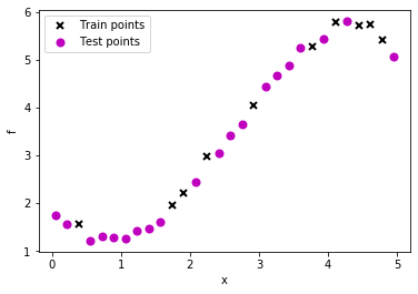
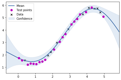
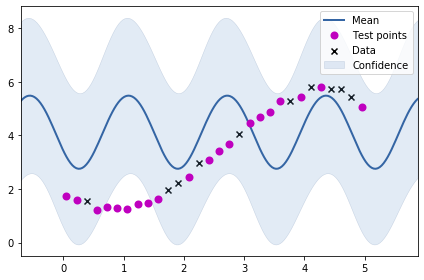
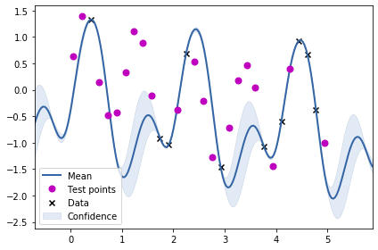
Thus far we had been hard coding the kernel parameters. Could we learn these? Yes, we can learn these by applying MLE. This might sound a little weird – learning prior parameters from data in the Bayesian setting?!
Code
k = GPy.kern.RBF(1)m = GPy.models.GPRegression(train_X, train_Y, k)m.optimize()
<paramz.optimization.optimization.opt_lbfgsb at 0x7f5239861390>
Code
m
Model: GP regression Objective: 6.219091605935309 Number of Parameters: 3 Number of Optimization Parameters: 3 Updates: True
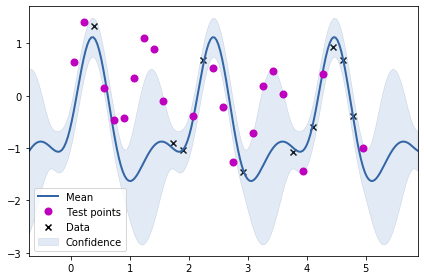
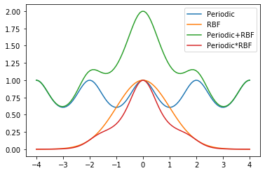
From the plot above, we can see that just using the periodic kernel is not very useful. Maybe we need to combine the RBF kernel with the periodic kernel? We will be trying two combinations: adding the two kernels and multiplying the two kernels to obtain two new kernels.
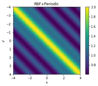
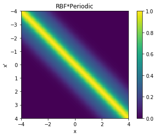
We can also visualise the covariance matrices corresponding to the two new kernels we have created.
Code
cov = k_combined_1.K(data,data)# Plot the covariance of the sample spaceplt.pcolor(data.T, data, cov)# Format and annotate plotplt.gca().invert_yaxis(), plt.gca().axis("image")plt.xlabel("x"), plt.ylabel("x'"), plt.colorbar()plt.title("RBF+Periodic");
Code
cov = k_combined_2.K(data,data)# Plot the covariance of the sample spaceplt.pcolor(data.T, data, cov)# Format and annotate plotplt.gca().invert_yaxis(), plt.gca().axis("image")plt.xlabel("x"), plt.ylabel("x'"), plt.colorbar()plt.title("RBF*Periodic");
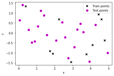
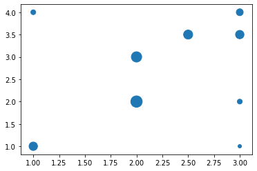
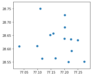
The above visualisation shows the dataset where the size of the marker denotes the value at that location. We will now be fitting a RBF kernel (expecting a 2d input) to this data set.
Code
k_2d = GPy.kern.RBF(input_dim=2, lengthscale=1)
Code
X.shape
(9, 2)
Code
m = GPy.models.GPRegression(X, y.reshape(-1, 1), k_2d)m.optimize()
<paramz.optimization.optimization.opt_lbfgsb at 0x7f521d185fd0>
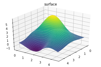
Generating predictions over the entire grid for visualisation.
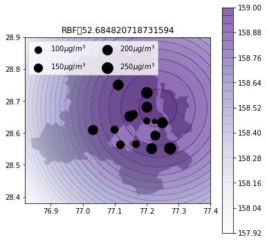
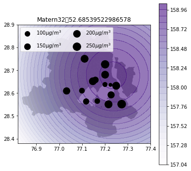
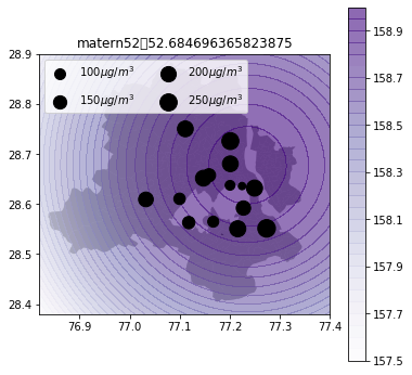
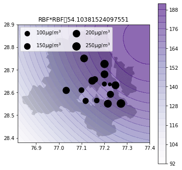
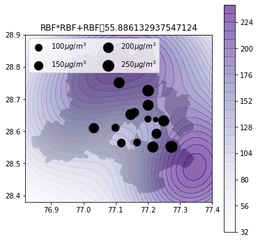
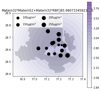
Now, we will be using GPs for predicting air quality in New Delhi. See my previous post on how to get AQ data for Delhi.https://nipunbatra.github.io/blog/air%20quality/2018/06/21/aq-india-map.html
I will be creating a function to visualise the AQ estimations using GPs based on different kernels.
The shapefile for Delhi can be downloaded from here.
Code
import pandas as pdimport osdf = pd.read_csv(os.path.expanduser("~/Downloads/2018-04-06.csv"))df = df[(df.country=='IN')&(df.city=='Delhi')&(df.parameter=='pm25')].dropna().groupby("location").mean()