From Vega-Lite to Matplotlib: A Tiny Spec-to-Code Translator

A small translator that lowers Vega-Lite JSON specs to readable Matplotlib code. v2 reworks it as a visitor class and adds aggregations, log scales, size encoding, area marks, layered charts, faceting, and filter transforms.
visualization
vega-lite
matplotlib
python
code-generation
dataviz
compilers
Author

Nipun Batra

Published

May 7, 2026

Vega-Lite is declarative; Matplotlib is imperative

Vega-Lite specs say what a plot is: a dataset, a mark type, a few encoding channels. Matplotlib code says how to draw it: figures, axes, calls to bar / scatter / plot, legends. This post walks through a small Python translator that lowers Vega-Lite JSON onto plain Matplotlib code so you can paste the output into a script.

A few reasons that’s useful:

  • Authors generate Vega-Lite via Altair / Observable / dashboards, then need plain Matplotlib to drop the figure into a LaTeX paper.
  • Vega-Lite is a great way to describe a plot. Matplotlib code is a great way to edit a plot — fonts, ticks, twin axes, callouts.
  • It’s a fun, short compiler exercise.

This is v2. The first cut was a single function with if mark == "bar": ... branches. That’s fine for five marks, but the moment you want layering (multiple marks on one axes), faceting (small multiples), or aggregate: "mean", the function turns into a hairball. The visitor pattern fixes that: one method per node type, recursing into children, returning emitted code lines.

What v2 supports:

  • marks: bar, point, circle, line, area, tick
  • encodings: x, y, color, size, opacity (plus optional title per channel)
  • aggregations: mean, sum, count, median, min, max on x or y
  • scales: log axes and explicit domain
  • containers: layer (overlay), column / row faceting (small multiples)
  • transforms: filter ("datum.x > 5" style)

What it still won’t do: hconcat/vconcat of unlike specs, time scales, named color schemes, tooltips/selections. Those would be straightforward additions to the visitor — just more methods.

Setup

Altair to render the original specs, Matplotlib to render the translated ones, pandas because it’s how Matplotlib likes to receive tabular data.

import json

import altair as alt
import matplotlib.pyplot as plt
import numpy as np
import pandas as pd
from IPython.display import display

%matplotlib inline
%config InlineBackend.figure_format = "retina"

plt.rcParams.update({
    "figure.dpi": 110,
    "savefig.dpi": 220,
    "axes.spines.top": False,
    "axes.spines.right": False,
})

alt.data_transformers.disable_max_rows()
print("altair", alt.__version__)
altair 6.0.0

The visitor class

The translator is a class that builds up a list of code lines. Public entry point is code(). Internally:

  • visit(spec) is the top-level dispatch: it picks visit_layer, visit_facet, or visit_unit based on the shape of the spec.
  • Mark dispatch happens via getattr(self, f"visit_mark_{mark}") — adding a new mark is just adding a method.
  • _emit_* helpers handle data, transforms, and axes — shared across all unit-level paths.
  • emit(...) and push_indent() / pop_indent() keep the output readable.

The whole class fits in roughly 200 lines, and vegalite_to_matplotlib(spec) is just a thin wrapper around VegaLiteToMatplotlib(spec).code() so the v1 calling convention still works.

SUPPORTED_AGGREGATES = {"mean", "sum", "count", "median", "min", "max"}


def _mark_type(spec):
    mark = spec.get("mark")
    return mark if isinstance(mark, str) else mark.get("type")


def _enc_label(enc_channel):
    if "title" in enc_channel:
        return enc_channel["title"]
    if "aggregate" in enc_channel and enc_channel.get("field"):
        return f"{enc_channel['aggregate']}({enc_channel['field']})"
    return enc_channel.get("field", "")


def _has_facet(spec):
    enc = spec.get("encoding", {})
    return "column" in enc or "row" in enc or "facet" in spec


class VegaLiteToMatplotlib:
    """Recursive Vega-Lite -> Matplotlib code translator.

    Dispatch:
      top-level    -> visit_layer | visit_facet | visit_unit
      mark         -> visit_mark_bar | visit_mark_point | visit_mark_circle
                       | visit_mark_line | visit_mark_area | visit_mark_tick
    """

    def __init__(self, spec):
        self.spec = spec
        self._lines = []
        self._indent = 0

    # --- emit / indent ---

    def emit(self, *lines):
        for line in lines:
            self._lines.append(("    " * self._indent + line) if line else "")

    def push_indent(self):
        self._indent += 1

    def pop_indent(self):
        self._indent -= 1

    # --- entry point ---

    def code(self):
        if self._lines:
            return "\n".join(self._lines)

        self.emit("import matplotlib.pyplot as plt")
        self.emit("import numpy as np")
        self.emit("import pandas as pd")
        self.emit("")

        spec = self.spec
        if _has_facet(spec):
            self.visit_facet(spec)
        elif "layer" in spec:
            self.emit("fig, ax = plt.subplots(figsize=(6, 3.6))")
            self.emit("")
            self.visit_layer(spec, ax_expr="ax")
            self.emit("fig.tight_layout()")
        else:
            self.emit("fig, ax = plt.subplots(figsize=(6, 3.6))")
            self.emit("")
            self.visit_unit(spec, ax_expr="ax")
            self.emit("fig.tight_layout()")

        self.emit("plt.show()")
        return "\n".join(self._lines)

    # --- top-level visitors ---

    def visit_unit(self, spec, ax_expr, df_expr=None):
        if df_expr is None:
            df_expr = "df"
            self._emit_data(spec, df_expr)
            self._emit_transforms(spec, df_expr)
        self._dispatch_mark(spec, ax_expr, df_expr)
        self._emit_axes(spec, ax_expr)

    def visit_layer(self, spec, ax_expr):
        outer_data = spec.get("data")
        for i, layer in enumerate(spec["layer"]):
            df_var = f"df_layer_{i}"
            inner = dict(layer)
            inner.setdefault("data", outer_data)
            self._emit_data(inner, df_var)
            self._emit_transforms(inner, df_var)
            self._dispatch_mark(inner, ax_expr, df_var)
        # axes from the first layer
        self._emit_axes(spec["layer"][0], ax_expr)
        if spec.get("title"):
            self.emit(f"{ax_expr}.set_title({_unwrap_title(spec['title'])!r})")

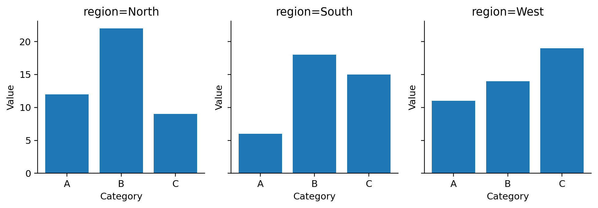
    def visit_facet(self, spec):
        enc = spec.get("encoding", {})
        col_field = enc.get("column", {}).get("field")
        row_field = enc.get("row", {}).get("field")
        if col_field is None and row_field is None:
            raise NotImplementedError("Facet requires column or row encoding")
        if col_field and row_field:
            raise NotImplementedError("2D faceting (column AND row) not implemented")

        self._emit_data(spec, "df")
        self._emit_transforms(spec, "df")

        facet_field = col_field or row_field
        is_column = col_field is not None
        self.emit(f"facet_values = list(dict.fromkeys(df[{facet_field!r}]))")
        if is_column:
            self.emit("fig, axes = plt.subplots(")
            self.emit("    1, len(facet_values),")
            self.emit("    figsize=(3.0 * len(facet_values), 3.2),")
            self.emit("    sharey=True,")
            self.emit(")")
        else:
            self.emit("fig, axes = plt.subplots(")
            self.emit("    len(facet_values), 1,")
            self.emit("    figsize=(5.0, 2.6 * len(facet_values)),")
            self.emit("    sharex=True,")
            self.emit(")")
        self.emit("if len(facet_values) == 1:")
        self.push_indent(); self.emit("axes = [axes]"); self.pop_indent()

        self.emit("for ax, facet_val in zip(axes, facet_values):")
        self.push_indent()
        self.emit(f"sub = df[df[{facet_field!r}] == facet_val]")
        inner = dict(spec)
        inner_enc = dict(enc)
        inner_enc.pop("column", None)
        inner_enc.pop("row", None)
        inner["encoding"] = inner_enc
        inner.pop("data", None)
        self.visit_unit(inner, ax_expr="ax", df_expr="sub")
        self.emit(f"ax.set_title(f'{facet_field}={{facet_val}}')")
        self.pop_indent()
        self.emit("fig.tight_layout()")

    # --- data / transforms ---

    def _emit_data(self, spec, df_var):
        data = spec.get("data") or {}
        if "values" in data:
            self.emit(f"{df_var} = pd.DataFrame({json.dumps(data['values'])})")
        elif "url" in data:
            self.emit(f"{df_var} = pd.read_json({data['url']!r})")
        elif "name" in data:
            self.emit(f"# expecting a name-bound dataset {data['name']!r}")
            self.emit(f"{df_var} = pd.DataFrame()")
        else:
            self.emit(f"{df_var} = pd.DataFrame()  # spec has no data")

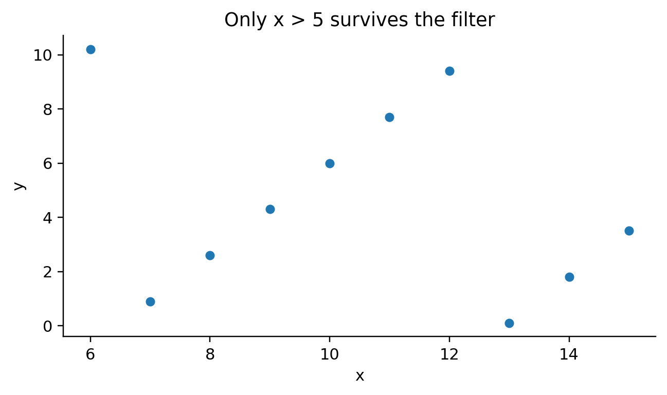
    def _emit_transforms(self, spec, df_var):
        for t in spec.get("transform", []):
            if "filter" in t and isinstance(t["filter"], str):
                py_expr = t["filter"].replace("datum.", f"{df_var}.")
                self.emit(f"{df_var} = {df_var}[{py_expr}].reset_index(drop=True)")
            else:
                self.emit(f"# unsupported transform skipped: {t}")

    # --- mark dispatch ---

    def _dispatch_mark(self, spec, ax_expr, df_expr):
        mark = _mark_type(spec)
        method = getattr(self, f"visit_mark_{mark}", None)
        if method is None:
            raise NotImplementedError(f"mark {mark!r} not supported")
        method(spec, ax_expr, df_expr)

    # --- mark visitors ---

    def visit_mark_bar(self, spec, ax_expr, df_expr):
        enc = spec["encoding"]
        x_field = enc["x"].get("field")
        y_field = enc["y"].get("field")
        x_agg = enc["x"].get("aggregate")
        y_agg = enc["y"].get("aggregate")
        color_field = enc.get("color", {}).get("field")

        if y_agg in SUPPORTED_AGGREGATES and not x_agg:
            self._emit_aggregated_bar(df_expr, ax_expr, x_field, y_field, y_agg,
                                       horizontal=False, color_field=color_field)
            return
        if x_agg in SUPPORTED_AGGREGATES and not y_agg:
            self._emit_aggregated_bar(df_expr, ax_expr, y_field, x_field, x_agg,
                                       horizontal=True, color_field=color_field)
            return

        if color_field is None:
            self.emit(f"{ax_expr}.bar({df_expr}[{x_field!r}], {df_expr}[{y_field!r}])")
            return

        self.emit(f"groups = list(dict.fromkeys({df_expr}[{color_field!r}]))")
        self.emit(f"x_vals = list(dict.fromkeys({df_expr}[{x_field!r}]))")
        self.emit("x_idx = np.arange(len(x_vals))")
        self.emit("width = 0.8 / max(1, len(groups))")
        self.emit("for i, g in enumerate(groups):")
        self.push_indent()
        self.emit(f"sub = {df_expr}[{df_expr}[{color_field!r}] == g]")
        self.emit(f"ys = [sub[sub[{x_field!r}] == xv][{y_field!r}].sum() for xv in x_vals]")
        self.emit(f"{ax_expr}.bar(x_idx + i * width - 0.4 + width / 2, ys, width, label=str(g))")
        self.pop_indent()
        self.emit(f"{ax_expr}.set_xticks(x_idx)")
        self.emit(f"{ax_expr}.set_xticklabels(x_vals)")
        self.emit(f"{ax_expr}.legend(title={color_field!r})")

    def _emit_aggregated_bar(self, df_expr, ax_expr, group_field, value_field,
                              agg, horizontal, color_field=None):
        if color_field is not None:
            # group by [group, color], pivot, side-by-side bars
            if agg == "count":
                self.emit(
                    f"agg_df = ({df_expr}.groupby([{group_field!r}, {color_field!r}])"
                    ".size().unstack(fill_value=0))"
                )
            else:
                self.emit(
                    f"agg_df = ({df_expr}.groupby([{group_field!r}, {color_field!r}])"
                    f"[{value_field!r}].{agg}().unstack(fill_value=0))"
                )
            self.emit("groups = list(agg_df.columns)")
            self.emit("x_vals = list(agg_df.index)")
            self.emit("x_idx = np.arange(len(x_vals))")
            self.emit("width = 0.8 / max(1, len(groups))")
            self.emit("for i, g in enumerate(groups):")
            self.push_indent()
            offset = "x_idx + i * width - 0.4 + width / 2"
            if horizontal:
                self.emit(f"{ax_expr}.barh({offset}, agg_df[g], width, label=str(g))")
            else:
                self.emit(f"{ax_expr}.bar({offset}, agg_df[g], width, label=str(g))")
            self.pop_indent()
            if horizontal:
                self.emit(f"{ax_expr}.set_yticks(x_idx)")
                self.emit(f"{ax_expr}.set_yticklabels(x_vals)")
            else:
                self.emit(f"{ax_expr}.set_xticks(x_idx)")
                self.emit(f"{ax_expr}.set_xticklabels(x_vals)")
            self.emit(f"{ax_expr}.legend(title={color_field!r})")
            return

        if agg == "count":
            self.emit(f"agg_df = {df_expr}.groupby({group_field!r}).size().reset_index(name='value')")
            value_col = "'value'"
        else:
            self.emit(
                f"agg_df = {df_expr}.groupby({group_field!r})[{value_field!r}]"
                f".{agg}().reset_index()"
            )
            value_col = f"{value_field!r}"
        if horizontal:
            self.emit(f"{ax_expr}.barh(agg_df[{group_field!r}], agg_df[{value_col}])")
        else:
            self.emit(f"{ax_expr}.bar(agg_df[{group_field!r}], agg_df[{value_col}])")

    def visit_mark_point(self, spec, ax_expr, df_expr):
        return self._emit_scatter(spec, ax_expr, df_expr)

    def visit_mark_circle(self, spec, ax_expr, df_expr):
        return self._emit_scatter(spec, ax_expr, df_expr)

    def _emit_scatter(self, spec, ax_expr, df_expr):
        enc = spec.get("encoding", {})
        x_field = enc["x"]["field"]
        y_field = enc["y"]["field"]
        color_field = enc.get("color", {}).get("field")
        size_field = enc.get("size", {}).get("field")
        opacity_field = enc.get("opacity", {}).get("field")

        size_arg = ", s=24"
        if size_field:
            size_arg = (
                f", s=({df_expr}[{size_field!r}] / max(1.0, {df_expr}[{size_field!r}]"
                ".max())) * 200 + 8"
            )
        alpha_arg = ""
        if opacity_field:
            alpha_arg = (
                f", alpha=({df_expr}[{opacity_field!r}] / max(1.0, {df_expr}"
                f"[{opacity_field!r}].max())).clip(0, 1)"
            )

        if color_field is None:
            self.emit(
                f"{ax_expr}.scatter({df_expr}[{x_field!r}], {df_expr}[{y_field!r}]"
                f"{size_arg}{alpha_arg})"
            )
            return

        sub_size = ", s=24"
        if size_field:
            sub_size = (
                f", s=(sub[{size_field!r}] / max(1.0, {df_expr}[{size_field!r}]"
                ".max())) * 200 + 8"
            )
        sub_alpha = ""
        if opacity_field:
            sub_alpha = (
                f", alpha=(sub[{opacity_field!r}] / max(1.0, {df_expr}"
                f"[{opacity_field!r}].max())).clip(0, 1)"
            )
        self.emit(f"for label, sub in {df_expr}.groupby({color_field!r}):")
        self.push_indent()
        self.emit(
            f"{ax_expr}.scatter(sub[{x_field!r}], sub[{y_field!r}]"
            f"{sub_size}{sub_alpha}, label=label)"
        )
        self.pop_indent()
        self.emit(f"{ax_expr}.legend(title={color_field!r})")

    def visit_mark_line(self, spec, ax_expr, df_expr):
        enc = spec.get("encoding", {})
        x_field = enc["x"]["field"]
        y_field = enc["y"]["field"]
        color_field = enc.get("color", {}).get("field")
        if color_field is None:
            self.emit(
                f"{ax_expr}.plot({df_expr}[{x_field!r}], {df_expr}[{y_field!r}], marker='o')"
            )
            return
        self.emit(f"for label, sub in {df_expr}.groupby({color_field!r}):")
        self.push_indent()
        self.emit(
            f"{ax_expr}.plot(sub[{x_field!r}], sub[{y_field!r}], marker='o', label=label)"
        )
        self.pop_indent()
        self.emit(f"{ax_expr}.legend(title={color_field!r})")

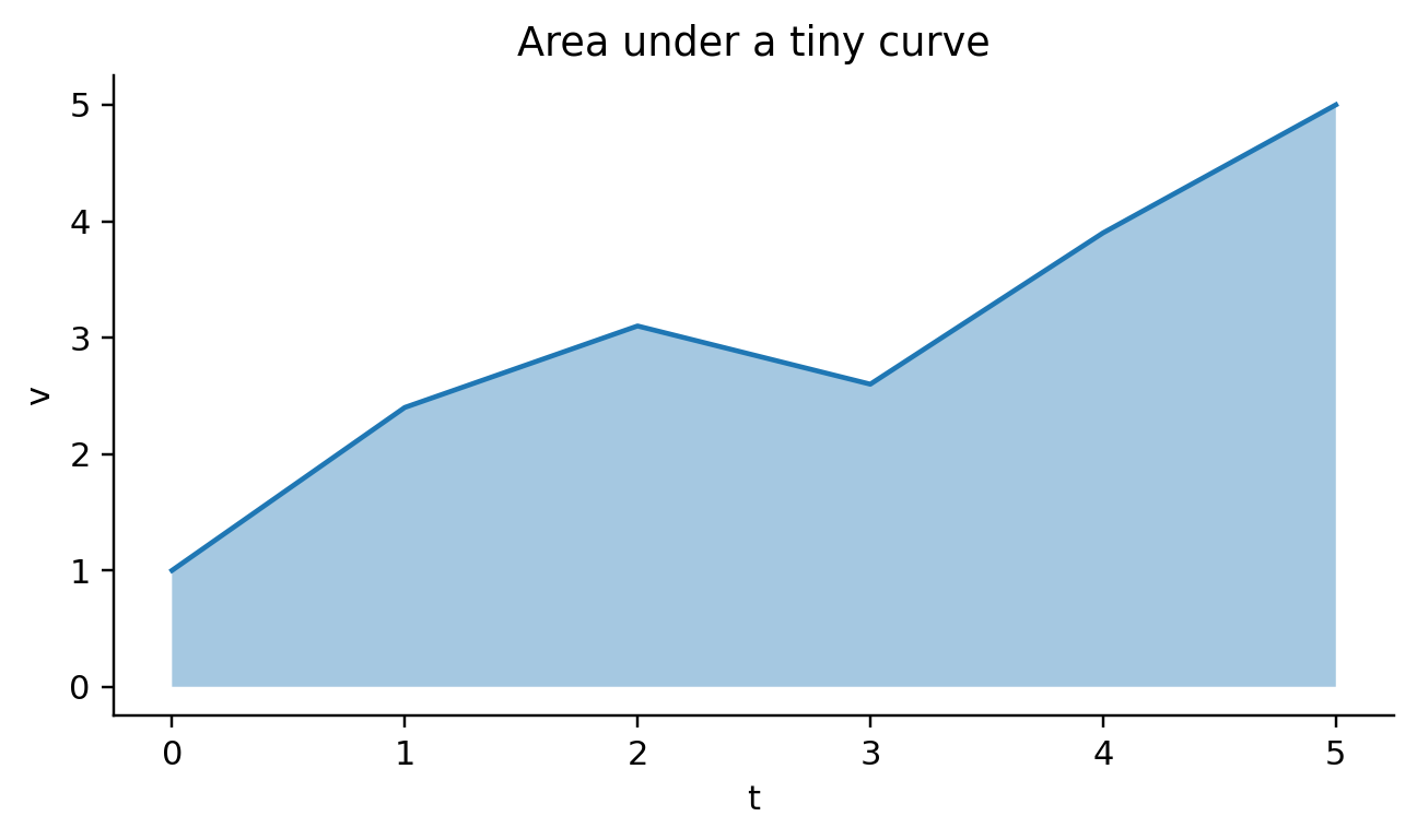
    def visit_mark_area(self, spec, ax_expr, df_expr):
        enc = spec.get("encoding", {})
        x_field = enc["x"]["field"]
        y_field = enc["y"]["field"]
        color_field = enc.get("color", {}).get("field")
        if color_field is None:
            self.emit(
                f"{ax_expr}.fill_between({df_expr}[{x_field!r}], "
                f"{df_expr}[{y_field!r}], alpha=0.4)"
            )
            self.emit(
                f"{ax_expr}.plot({df_expr}[{x_field!r}], {df_expr}[{y_field!r}])"
            )
            return
        self.emit(f"for label, sub in {df_expr}.groupby({color_field!r}):")
        self.push_indent()
        self.emit(
            f"{ax_expr}.fill_between(sub[{x_field!r}], sub[{y_field!r}], "
            "alpha=0.35, label=label)"
        )
        self.pop_indent()
        self.emit(f"{ax_expr}.legend(title={color_field!r})")

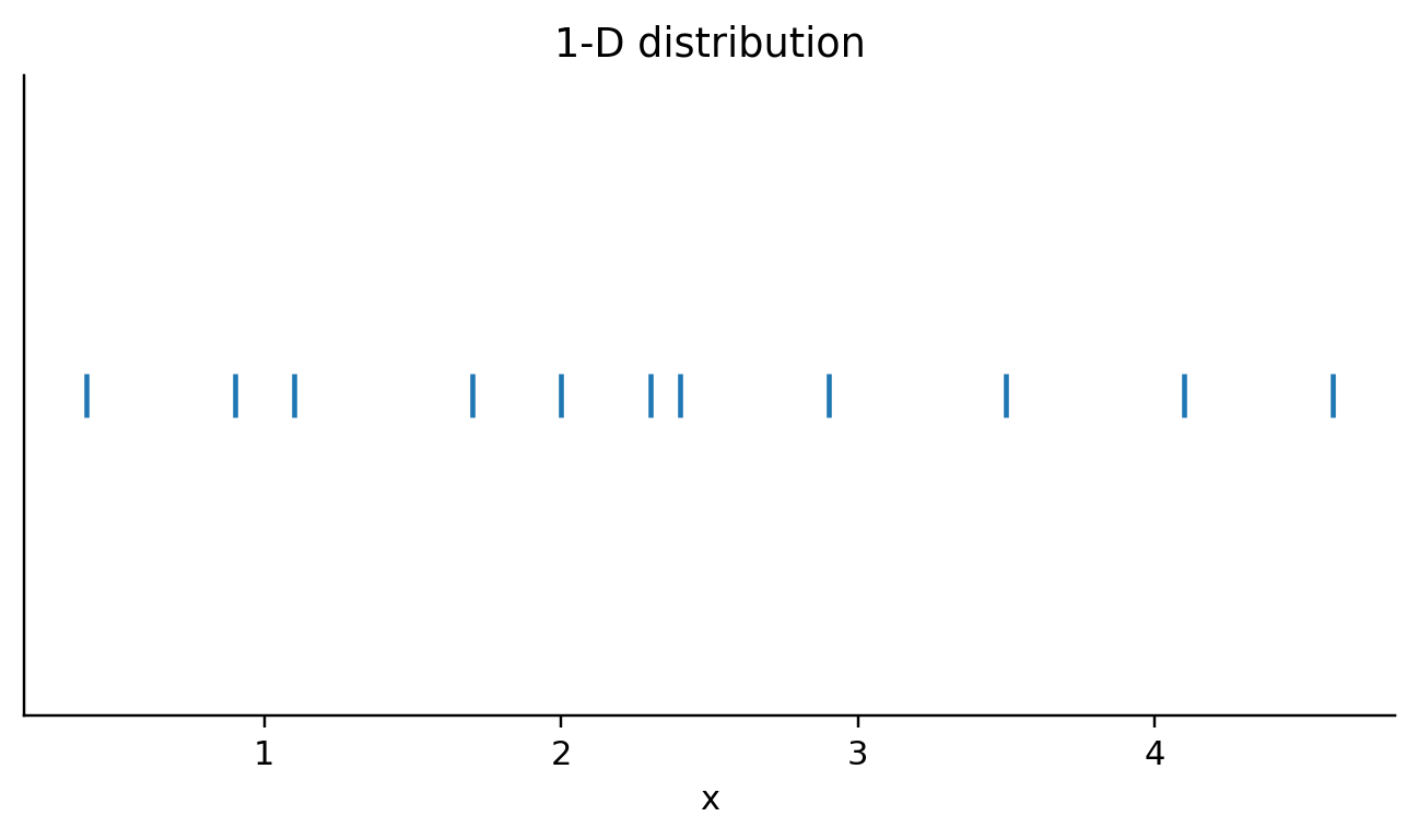
    def visit_mark_tick(self, spec, ax_expr, df_expr):
        enc = spec.get("encoding", {})
        x_field = enc["x"]["field"]
        y_field = enc.get("y", {}).get("field")
        if y_field:
            self.emit(
                f"{ax_expr}.scatter({df_expr}[{x_field!r}], {df_expr}[{y_field!r}], "
                "marker='|', s=180)"
            )
        else:
            self.emit(
                f"{ax_expr}.scatter({df_expr}[{x_field!r}], "
                f"np.zeros(len({df_expr})), marker='|', s=180)"
            )
            self.emit(f"{ax_expr}.set_yticks([])")

    # --- axis decoration ---

    def _emit_axes(self, spec, ax_expr):
        enc = spec.get("encoding", {})
        if "x" in enc:
            self.emit(f"{ax_expr}.set_xlabel({_enc_label(enc['x'])!r})")
            scale = enc["x"].get("scale", {}) or {}
            if scale.get("type") == "log":
                self.emit(f"{ax_expr}.set_xscale('log')")
            if "domain" in scale:
                lo, hi = scale["domain"]
                self.emit(f"{ax_expr}.set_xlim({lo}, {hi})")
        if "y" in enc:
            self.emit(f"{ax_expr}.set_ylabel({_enc_label(enc['y'])!r})")
            scale = enc["y"].get("scale", {}) or {}
            if scale.get("type") == "log":
                self.emit(f"{ax_expr}.set_yscale('log')")
            if "domain" in scale:
                lo, hi = scale["domain"]
                self.emit(f"{ax_expr}.set_ylim({lo}, {hi})")
        if spec.get("title"):
            self.emit(f"{ax_expr}.set_title({_unwrap_title(spec['title'])!r})")


def _unwrap_title(title):
    if isinstance(title, dict):
        return title.get("text", "")
    return title


def vegalite_to_matplotlib(spec):
    """Backward-compatible wrapper around the visitor."""
    return VegaLiteToMatplotlib(spec).code()


def render_generated(code):
    exec(compile(code, "<generated-mpl>", "exec"), {})


def show_side_by_side(spec):
    print("--- generated Matplotlib code ---")
    code = vegalite_to_matplotlib(spec)
    print(code)
    print()
    print("--- Altair render of the original spec ---")
    display(alt.Chart.from_dict(spec).properties(width=320, height=200))
    print("--- Matplotlib render of the generated code ---")
    render_generated(code)

Example 1: a bar chart

Same as v1 — quick smoke test that the visitor hasn’t broken backward compatibility.

spec_bar = {
    "data": {"values": [
        {"category": "A", "value": 28},
        {"category": "B", "value": 55},
        {"category": "C", "value": 43},
        {"category": "D", "value": 91},
        {"category": "E", "value": 81},
        {"category": "F", "value": 53},
        {"category": "G", "value": 19},
        {"category": "H", "value": 87},
    ]},
    "mark": "bar",
    "encoding": {
        "x": {"field": "category", "type": "nominal", "title": "Category"},
        "y": {"field": "value", "type": "quantitative", "title": "Value"},
    },
    "title": "A bar chart",
}
show_side_by_side(spec_bar)
--- generated Matplotlib code ---
import matplotlib.pyplot as plt
import numpy as np
import pandas as pd

fig, ax = plt.subplots(figsize=(6, 3.6))

df = pd.DataFrame([{"category": "A", "value": 28}, {"category": "B", "value": 55}, {"category": "C", "value": 43}, {"category": "D", "value": 91}, {"category": "E", "value": 81}, {"category": "F", "value": 53}, {"category": "G", "value": 19}, {"category": "H", "value": 87}])
ax.bar(df['category'], df['value'])
ax.set_xlabel('Category')
ax.set_ylabel('Value')
ax.set_title('A bar chart')
fig.tight_layout()
plt.show()

--- Altair render of the original spec ---
--- Matplotlib render of the generated code ---

Example 2: scatter, no color

spec_scatter = {
    "data": {"values": [
        {"hp": 130, "mpg": 18.0},
        {"hp": 165, "mpg": 15.0},
        {"hp": 150, "mpg": 18.0},
        {"hp": 95,  "mpg": 24.0},
        {"hp": 70,  "mpg": 27.0},
        {"hp": 198, "mpg": 14.0},
        {"hp": 88,  "mpg": 27.0},
        {"hp": 215, "mpg": 10.0},
        {"hp": 105, "mpg": 22.0},
        {"hp": 75,  "mpg": 26.0},
    ]},
    "mark": "point",
    "encoding": {
        "x": {"field": "hp", "type": "quantitative", "title": "Horsepower"},
        "y": {"field": "mpg", "type": "quantitative", "title": "Miles per gallon"},
    },
    "title": "Cars: HP vs MPG",
}
show_side_by_side(spec_scatter)
--- generated Matplotlib code ---
import matplotlib.pyplot as plt
import numpy as np
import pandas as pd

fig, ax = plt.subplots(figsize=(6, 3.6))

df = pd.DataFrame([{"hp": 130, "mpg": 18.0}, {"hp": 165, "mpg": 15.0}, {"hp": 150, "mpg": 18.0}, {"hp": 95, "mpg": 24.0}, {"hp": 70, "mpg": 27.0}, {"hp": 198, "mpg": 14.0}, {"hp": 88, "mpg": 27.0}, {"hp": 215, "mpg": 10.0}, {"hp": 105, "mpg": 22.0}, {"hp": 75, "mpg": 26.0}])
ax.scatter(df['hp'], df['mpg'], s=24)
ax.set_xlabel('Horsepower')
ax.set_ylabel('Miles per gallon')
ax.set_title('Cars: HP vs MPG')
fig.tight_layout()
plt.show()

--- Altair render of the original spec ---
--- Matplotlib render of the generated code ---

Example 3: scatter with categorical color

spec_scatter_color = {
    "data": {"values": [
        {"hp": 130, "mpg": 18.0, "origin": "USA"},
        {"hp": 165, "mpg": 15.0, "origin": "USA"},
        {"hp": 150, "mpg": 18.0, "origin": "USA"},
        {"hp": 95,  "mpg": 24.0, "origin": "Japan"},
        {"hp": 70,  "mpg": 27.0, "origin": "Japan"},
        {"hp": 88,  "mpg": 27.0, "origin": "Japan"},
        {"hp": 75,  "mpg": 26.0, "origin": "Europe"},
        {"hp": 105, "mpg": 22.0, "origin": "Europe"},
        {"hp": 110, "mpg": 21.0, "origin": "Europe"},
    ]},
    "mark": "point",
    "encoding": {
        "x": {"field": "hp", "type": "quantitative", "title": "Horsepower"},
        "y": {"field": "mpg", "type": "quantitative", "title": "Miles per gallon"},
        "color": {"field": "origin", "type": "nominal"},
    },
    "title": "Cars by origin",
}
show_side_by_side(spec_scatter_color)
--- generated Matplotlib code ---
import matplotlib.pyplot as plt
import numpy as np
import pandas as pd

fig, ax = plt.subplots(figsize=(6, 3.6))

df = pd.DataFrame([{"hp": 130, "mpg": 18.0, "origin": "USA"}, {"hp": 165, "mpg": 15.0, "origin": "USA"}, {"hp": 150, "mpg": 18.0, "origin": "USA"}, {"hp": 95, "mpg": 24.0, "origin": "Japan"}, {"hp": 70, "mpg": 27.0, "origin": "Japan"}, {"hp": 88, "mpg": 27.0, "origin": "Japan"}, {"hp": 75, "mpg": 26.0, "origin": "Europe"}, {"hp": 105, "mpg": 22.0, "origin": "Europe"}, {"hp": 110, "mpg": 21.0, "origin": "Europe"}])
for label, sub in df.groupby('origin'):
    ax.scatter(sub['hp'], sub['mpg'], s=24, label=label)
ax.legend(title='origin')
ax.set_xlabel('Horsepower')
ax.set_ylabel('Miles per gallon')
ax.set_title('Cars by origin')
fig.tight_layout()
plt.show()

--- Altair render of the original spec ---
--- Matplotlib render of the generated code ---

Example 4: line chart with grouped series

spec_line = {
    "data": {"values": [
        {"month": "Jan", "city": "Bengaluru", "rainfall_mm": 2},
        {"month": "Feb", "city": "Bengaluru", "rainfall_mm": 6},
        {"month": "Mar", "city": "Bengaluru", "rainfall_mm": 11},
        {"month": "Apr", "city": "Bengaluru", "rainfall_mm": 38},
        {"month": "May", "city": "Bengaluru", "rainfall_mm": 105},
        {"month": "Jun", "city": "Bengaluru", "rainfall_mm": 88},
        {"month": "Jan", "city": "Mumbai", "rainfall_mm": 0},
        {"month": "Feb", "city": "Mumbai", "rainfall_mm": 0},
        {"month": "Mar", "city": "Mumbai", "rainfall_mm": 0},
        {"month": "Apr", "city": "Mumbai", "rainfall_mm": 1},
        {"month": "May", "city": "Mumbai", "rainfall_mm": 12},
        {"month": "Jun", "city": "Mumbai", "rainfall_mm": 540},
    ]},
    "mark": "line",
    "encoding": {
        "x": {"field": "month", "type": "ordinal", "title": "Month"},
        "y": {"field": "rainfall_mm", "type": "quantitative", "title": "Rainfall (mm)"},
        "color": {"field": "city", "type": "nominal"},
    },
    "title": "Monthly rainfall, Jan-Jun",
}
show_side_by_side(spec_line)
--- generated Matplotlib code ---
import matplotlib.pyplot as plt
import numpy as np
import pandas as pd

fig, ax = plt.subplots(figsize=(6, 3.6))

df = pd.DataFrame([{"month": "Jan", "city": "Bengaluru", "rainfall_mm": 2}, {"month": "Feb", "city": "Bengaluru", "rainfall_mm": 6}, {"month": "Mar", "city": "Bengaluru", "rainfall_mm": 11}, {"month": "Apr", "city": "Bengaluru", "rainfall_mm": 38}, {"month": "May", "city": "Bengaluru", "rainfall_mm": 105}, {"month": "Jun", "city": "Bengaluru", "rainfall_mm": 88}, {"month": "Jan", "city": "Mumbai", "rainfall_mm": 0}, {"month": "Feb", "city": "Mumbai", "rainfall_mm": 0}, {"month": "Mar", "city": "Mumbai", "rainfall_mm": 0}, {"month": "Apr", "city": "Mumbai", "rainfall_mm": 1}, {"month": "May", "city": "Mumbai", "rainfall_mm": 12}, {"month": "Jun", "city": "Mumbai", "rainfall_mm": 540}])
for label, sub in df.groupby('city'):
    ax.plot(sub['month'], sub['rainfall_mm'], marker='o', label=label)
ax.legend(title='city')
ax.set_xlabel('Month')
ax.set_ylabel('Rainfall (mm)')
ax.set_title('Monthly rainfall, Jan-Jun')
fig.tight_layout()
plt.show()

--- Altair render of the original spec ---
--- Matplotlib render of the generated code ---

Example 5: grouped bars

spec_grouped = {
    "data": {"values": [
        {"quarter": "Q1", "team": "A", "score": 12},
        {"quarter": "Q2", "team": "A", "score": 17},
        {"quarter": "Q3", "team": "A", "score": 9},
        {"quarter": "Q4", "team": "A", "score": 14},
        {"quarter": "Q1", "team": "B", "score": 8},
        {"quarter": "Q2", "team": "B", "score": 19},
        {"quarter": "Q3", "team": "B", "score": 15},
        {"quarter": "Q4", "team": "B", "score": 11},
    ]},
    "mark": "bar",
    "encoding": {
        "x": {"field": "quarter", "type": "nominal", "title": "Quarter"},
        "y": {"field": "score", "type": "quantitative", "title": "Score"},
        "color": {"field": "team", "type": "nominal"},
    },
    "title": "Team scores by quarter",
}
show_side_by_side(spec_grouped)
--- generated Matplotlib code ---
import matplotlib.pyplot as plt
import numpy as np
import pandas as pd

fig, ax = plt.subplots(figsize=(6, 3.6))

df = pd.DataFrame([{"quarter": "Q1", "team": "A", "score": 12}, {"quarter": "Q2", "team": "A", "score": 17}, {"quarter": "Q3", "team": "A", "score": 9}, {"quarter": "Q4", "team": "A", "score": 14}, {"quarter": "Q1", "team": "B", "score": 8}, {"quarter": "Q2", "team": "B", "score": 19}, {"quarter": "Q3", "team": "B", "score": 15}, {"quarter": "Q4", "team": "B", "score": 11}])
groups = list(dict.fromkeys(df['team']))
x_vals = list(dict.fromkeys(df['quarter']))
x_idx = np.arange(len(x_vals))
width = 0.8 / max(1, len(groups))
for i, g in enumerate(groups):
    sub = df[df['team'] == g]
    ys = [sub[sub['quarter'] == xv]['score'].sum() for xv in x_vals]
    ax.bar(x_idx + i * width - 0.4 + width / 2, ys, width, label=str(g))
ax.set_xticks(x_idx)
ax.set_xticklabels(x_vals)
ax.legend(title='team')
ax.set_xlabel('Quarter')
ax.set_ylabel('Score')
ax.set_title('Team scores by quarter')
fig.tight_layout()
plt.show()

--- Altair render of the original spec ---
--- Matplotlib render of the generated code ---

Example 6: aggregated bar (mean over a group)

Vega-Lite encodings can carry an aggregate field. Here y says “average mpg per origin” — the visitor emits a groupby(...).mean() step before plotting and the axis label becomes mean(mpg).

spec_agg_bar = {
    "data": {"values": [
        {"origin": "USA",    "mpg": 18.0},
        {"origin": "USA",    "mpg": 15.0},
        {"origin": "USA",    "mpg": 14.0},
        {"origin": "USA",    "mpg": 16.5},
        {"origin": "Japan",  "mpg": 27.0},
        {"origin": "Japan",  "mpg": 30.0},
        {"origin": "Japan",  "mpg": 25.0},
        {"origin": "Europe", "mpg": 22.0},
        {"origin": "Europe", "mpg": 19.0},
        {"origin": "Europe", "mpg": 24.0},
    ]},
    "mark": "bar",
    "encoding": {
        "x": {"field": "origin", "type": "nominal", "title": "Origin"},
        "y": {"field": "mpg", "type": "quantitative", "aggregate": "mean"},
    },
    "title": "Average MPG by origin",
}
show_side_by_side(spec_agg_bar)
--- generated Matplotlib code ---
import matplotlib.pyplot as plt
import numpy as np
import pandas as pd

fig, ax = plt.subplots(figsize=(6, 3.6))

df = pd.DataFrame([{"origin": "USA", "mpg": 18.0}, {"origin": "USA", "mpg": 15.0}, {"origin": "USA", "mpg": 14.0}, {"origin": "USA", "mpg": 16.5}, {"origin": "Japan", "mpg": 27.0}, {"origin": "Japan", "mpg": 30.0}, {"origin": "Japan", "mpg": 25.0}, {"origin": "Europe", "mpg": 22.0}, {"origin": "Europe", "mpg": 19.0}, {"origin": "Europe", "mpg": 24.0}])
agg_df = df.groupby('origin')['mpg'].mean().reset_index()
ax.bar(agg_df['origin'], agg_df['mpg'])
ax.set_xlabel('Origin')
ax.set_ylabel('mean(mpg)')
ax.set_title('Average MPG by origin')
fig.tight_layout()
plt.show()

--- Altair render of the original spec ---
--- Matplotlib render of the generated code ---

Example 7: log-scale axes plus a size channel

The visitor reads scale: {"type": "log"} from the x encoding and emits ax.set_xscale('log'). The size channel maps a numeric field to scatter point size with a normalized scaling.

spec_log_size = {
    "data": {"values": [
        {"gdp_per_capita": 1500,  "life_expectancy": 60, "population": 1.5e9},
        {"gdp_per_capita": 2200,  "life_expectancy": 67, "population": 1.4e9},
        {"gdp_per_capita": 8000,  "life_expectancy": 73, "population": 2.1e8},
        {"gdp_per_capita": 12000, "life_expectancy": 76, "population": 5.2e7},
        {"gdp_per_capita": 35000, "life_expectancy": 82, "population": 1.3e8},
        {"gdp_per_capita": 45000, "life_expectancy": 81, "population": 8.5e7},
        {"gdp_per_capita": 65000, "life_expectancy": 82, "population": 3.3e8},
    ]},
    "mark": "circle",
    "encoding": {
        "x": {"field": "gdp_per_capita", "type": "quantitative",
              "scale": {"type": "log"}, "title": "GDP per capita (log)"},
        "y": {"field": "life_expectancy", "type": "quantitative",
              "title": "Life expectancy (years)"},
        "size": {"field": "population", "type": "quantitative"},
    },
    "title": "Hans-Rosling-ish",
}
show_side_by_side(spec_log_size)
--- generated Matplotlib code ---
import matplotlib.pyplot as plt
import numpy as np
import pandas as pd

fig, ax = plt.subplots(figsize=(6, 3.6))

df = pd.DataFrame([{"gdp_per_capita": 1500, "life_expectancy": 60, "population": 1500000000.0}, {"gdp_per_capita": 2200, "life_expectancy": 67, "population": 1400000000.0}, {"gdp_per_capita": 8000, "life_expectancy": 73, "population": 210000000.0}, {"gdp_per_capita": 12000, "life_expectancy": 76, "population": 52000000.0}, {"gdp_per_capita": 35000, "life_expectancy": 82, "population": 130000000.0}, {"gdp_per_capita": 45000, "life_expectancy": 81, "population": 85000000.0}, {"gdp_per_capita": 65000, "life_expectancy": 82, "population": 330000000.0}])
ax.scatter(df['gdp_per_capita'], df['life_expectancy'], s=(df['population'] / max(1.0, df['population'].max())) * 200 + 8)
ax.set_xlabel('GDP per capita (log)')
ax.set_xscale('log')
ax.set_ylabel('Life expectancy (years)')
ax.set_title('Hans-Rosling-ish')
fig.tight_layout()
plt.show()

--- Altair render of the original spec ---
--- Matplotlib render of the generated code ---

Example 8: layered chart (scatter + trend line)

A layer block combines two unit specs into one Matplotlib axes. The visitor walks each layer, emits its own dataframe + transform + mark, and shares the axes. We pass a separate dataframe for the trend line so the demo doesn’t need an extra regression step.

spec_layer = {
    "data": {"values": [
        {"x": 1, "y": 2.1}, {"x": 2, "y": 3.7}, {"x": 3, "y": 5.0},
        {"x": 4, "y": 7.2}, {"x": 5, "y": 8.6}, {"x": 6, "y": 10.4},
        {"x": 7, "y": 12.0}, {"x": 8, "y": 13.7},
    ]},
    "layer": [
        {"mark": "point",
         "encoding": {
             "x": {"field": "x", "type": "quantitative", "title": "x"},
             "y": {"field": "y", "type": "quantitative", "title": "y"},
         }},
        {"data": {"values": [
            {"x": 1, "y_pred": 2.0}, {"x": 8, "y_pred": 14.0},
         ]},
         "mark": "line",
         "encoding": {
             "x": {"field": "x", "type": "quantitative"},
             "y": {"field": "y_pred", "type": "quantitative"},
         }},
    ],
    "title": "Observations + linear trend",
}
show_side_by_side(spec_layer)
--- generated Matplotlib code ---
import matplotlib.pyplot as plt
import numpy as np
import pandas as pd

fig, ax = plt.subplots(figsize=(6, 3.6))

df_layer_0 = pd.DataFrame([{"x": 1, "y": 2.1}, {"x": 2, "y": 3.7}, {"x": 3, "y": 5.0}, {"x": 4, "y": 7.2}, {"x": 5, "y": 8.6}, {"x": 6, "y": 10.4}, {"x": 7, "y": 12.0}, {"x": 8, "y": 13.7}])
ax.scatter(df_layer_0['x'], df_layer_0['y'], s=24)
df_layer_1 = pd.DataFrame([{"x": 1, "y_pred": 2.0}, {"x": 8, "y_pred": 14.0}])
ax.plot(df_layer_1['x'], df_layer_1['y_pred'], marker='o')
ax.set_xlabel('x')
ax.set_ylabel('y')
ax.set_title('Observations + linear trend')
fig.tight_layout()
plt.show()

--- Altair render of the original spec ---
--- Matplotlib render of the generated code ---

Example 9: faceted small multiples

A column encoding triggers visit_facet: the visitor builds a 1xN grid of Axes objects, recurses with each subset of the dataframe, and titles each panel.

spec_facet = {
    "data": {"values": [
        {"region": "North", "category": "A", "value": 12},
        {"region": "North", "category": "B", "value": 22},
        {"region": "North", "category": "C", "value": 9},
        {"region": "South", "category": "A", "value": 6},
        {"region": "South", "category": "B", "value": 18},
        {"region": "South", "category": "C", "value": 15},
        {"region": "West",  "category": "A", "value": 11},
        {"region": "West",  "category": "B", "value": 14},
        {"region": "West",  "category": "C", "value": 19},
    ]},
    "mark": "bar",
    "encoding": {
        "x": {"field": "category", "type": "nominal", "title": "Category"},
        "y": {"field": "value", "type": "quantitative", "title": "Value"},
        "column": {"field": "region", "type": "nominal"},
    },
    "title": "Small multiples by region",
}
show_side_by_side(spec_facet)
--- generated Matplotlib code ---
import matplotlib.pyplot as plt
import numpy as np
import pandas as pd

df = pd.DataFrame([{"region": "North", "category": "A", "value": 12}, {"region": "North", "category": "B", "value": 22}, {"region": "North", "category": "C", "value": 9}, {"region": "South", "category": "A", "value": 6}, {"region": "South", "category": "B", "value": 18}, {"region": "South", "category": "C", "value": 15}, {"region": "West", "category": "A", "value": 11}, {"region": "West", "category": "B", "value": 14}, {"region": "West", "category": "C", "value": 19}])
facet_values = list(dict.fromkeys(df['region']))
fig, axes = plt.subplots(
    1, len(facet_values),
    figsize=(3.0 * len(facet_values), 3.2),
    sharey=True,
)
if len(facet_values) == 1:
    axes = [axes]
for ax, facet_val in zip(axes, facet_values):
    sub = df[df['region'] == facet_val]
    ax.bar(sub['category'], sub['value'])
    ax.set_xlabel('Category')
    ax.set_ylabel('Value')
    ax.set_title('Small multiples by region')
    ax.set_title(f'region={facet_val}')
fig.tight_layout()
plt.show()

--- Altair render of the original spec ---
--- Matplotlib render of the generated code ---

Example 10: a filter transform

transform: [{"filter": "datum.x > 5"}] is rewritten into a pandas boolean mask. The string is rewritten naively (datum.df.), which is good enough for simple boolean expressions.

spec_filter = {
    "data": {"values": [
        {"x": i, "y": (i * 1.7) % 11} for i in range(1, 16)
    ]},
    "transform": [{"filter": "datum.x > 5"}],
    "mark": "point",
    "encoding": {
        "x": {"field": "x", "type": "quantitative"},
        "y": {"field": "y", "type": "quantitative"},
    },
    "title": "Only x > 5 survives the filter",
}
show_side_by_side(spec_filter)
--- generated Matplotlib code ---
import matplotlib.pyplot as plt
import numpy as np
import pandas as pd

fig, ax = plt.subplots(figsize=(6, 3.6))

df = pd.DataFrame([{"x": 1, "y": 1.7}, {"x": 2, "y": 3.4}, {"x": 3, "y": 5.1}, {"x": 4, "y": 6.8}, {"x": 5, "y": 8.5}, {"x": 6, "y": 10.2}, {"x": 7, "y": 0.9000000000000004}, {"x": 8, "y": 2.5999999999999996}, {"x": 9, "y": 4.299999999999999}, {"x": 10, "y": 6.0}, {"x": 11, "y": 7.699999999999999}, {"x": 12, "y": 9.399999999999999}, {"x": 13, "y": 0.09999999999999787}, {"x": 14, "y": 1.8000000000000007}, {"x": 15, "y": 3.5}])
df = df[df.x > 5].reset_index(drop=True)
ax.scatter(df['x'], df['y'], s=24)
ax.set_xlabel('x')
ax.set_ylabel('y')
ax.set_title('Only x > 5 survives the filter')
fig.tight_layout()
plt.show()

--- Altair render of the original spec ---
--- Matplotlib render of the generated code ---

Example 11: area and tick marks

Two marks the visitor learned in v2. area uses fill_between; tick uses a vertical-bar marker, optionally over a y axis when given.

spec_area = {
    "data": {"values": [
        {"t": 0, "v": 1.0}, {"t": 1, "v": 2.4}, {"t": 2, "v": 3.1},
        {"t": 3, "v": 2.6}, {"t": 4, "v": 3.9}, {"t": 5, "v": 5.0},
    ]},
    "mark": "area",
    "encoding": {
        "x": {"field": "t", "type": "quantitative", "title": "t"},
        "y": {"field": "v", "type": "quantitative", "title": "v"},
    },
    "title": "Area under a tiny curve",
}
show_side_by_side(spec_area)

spec_tick = {
    "data": {"values": [
        {"x": v} for v in [0.4, 0.9, 1.1, 1.7, 2.0, 2.3, 2.4, 2.9, 3.5, 4.1, 4.6]
    ]},
    "mark": "tick",
    "encoding": {"x": {"field": "x", "type": "quantitative", "title": "x"}},
    "title": "1-D distribution",
}
show_side_by_side(spec_tick)
--- generated Matplotlib code ---
import matplotlib.pyplot as plt
import numpy as np
import pandas as pd

fig, ax = plt.subplots(figsize=(6, 3.6))

df = pd.DataFrame([{"t": 0, "v": 1.0}, {"t": 1, "v": 2.4}, {"t": 2, "v": 3.1}, {"t": 3, "v": 2.6}, {"t": 4, "v": 3.9}, {"t": 5, "v": 5.0}])
ax.fill_between(df['t'], df['v'], alpha=0.4)
ax.plot(df['t'], df['v'])
ax.set_xlabel('t')
ax.set_ylabel('v')
ax.set_title('Area under a tiny curve')
fig.tight_layout()
plt.show()

--- Altair render of the original spec ---
--- Matplotlib render of the generated code ---

--- generated Matplotlib code ---
import matplotlib.pyplot as plt
import numpy as np
import pandas as pd

fig, ax = plt.subplots(figsize=(6, 3.6))

df = pd.DataFrame([{"x": 0.4}, {"x": 0.9}, {"x": 1.1}, {"x": 1.7}, {"x": 2.0}, {"x": 2.3}, {"x": 2.4}, {"x": 2.9}, {"x": 3.5}, {"x": 4.1}, {"x": 4.6}])
ax.scatter(df['x'], np.zeros(len(df)), marker='|', s=180)
ax.set_yticks([])
ax.set_xlabel('x')
ax.set_title('1-D distribution')
fig.tight_layout()
plt.show()

--- Altair render of the original spec ---
--- Matplotlib render of the generated code ---

Robustness: explicit errors when something is unsupported

Passing a mark the visitor doesn’t know about raises a clear NotImplementedError. This is the v2 robustness story: instead of silently emitting broken code or KeyError-ing partway through, the translator stops at the first node it can’t handle and tells you which one.

spec_unsupported = {
    "data": {"values": [{"x": 1, "y": 2}]},
    "mark": "rule",  # not in the supported set
    "encoding": {
        "x": {"field": "x", "type": "quantitative"},
        "y": {"field": "y", "type": "quantitative"},
    },
}
try:
    vegalite_to_matplotlib(spec_unsupported)
except NotImplementedError as e:
    print("translator stopped cleanly:", e)
translator stopped cleanly: mark 'rule' not supported

Still out of scope

  • hconcat / vconcat of arbitrary unit specs — the visitor handles column/row faceting where each panel is the same shape, but freely concatenated panels need a more general grid builder.
  • Time scales. Vega-Lite’s temporal type would map to matplotlib.dates. Easy to wire up via _emit_axes.
  • Named color schemes (category10, viridis). Map them to Matplotlib cmaps in a small lookup.
  • Tooltips, selections, parameters. No analogue in static Matplotlib.
  • Resolved scales / shared legends across complex layered+faceted specs. Real compiler territory.

The shape of the visitor makes all of these additive: each is a new method or a new branch in _emit_axes, not a rewrite.

Closing thought

The first version of this translator was a single function with a stack of if mark == "x" branches. That was fine while there were only five marks. The moment the spec language acquired structure (layers, facets, transforms), the function had to acquire structure too — and the visitor pattern gives that structure for almost free. One method per node type, recursion for containers, dispatch via getattr for marks.

The bigger point: a plot DSL like Vega-Lite is just a tree, and translating it to Matplotlib is just a tree walk that emits Python source. The hard parts of dataviz aren’t in either DSL — they’re in the choices about what to plot. Once you’ve made those choices, lowering them onto whichever backend you need is a couple hundred lines of switch statements.