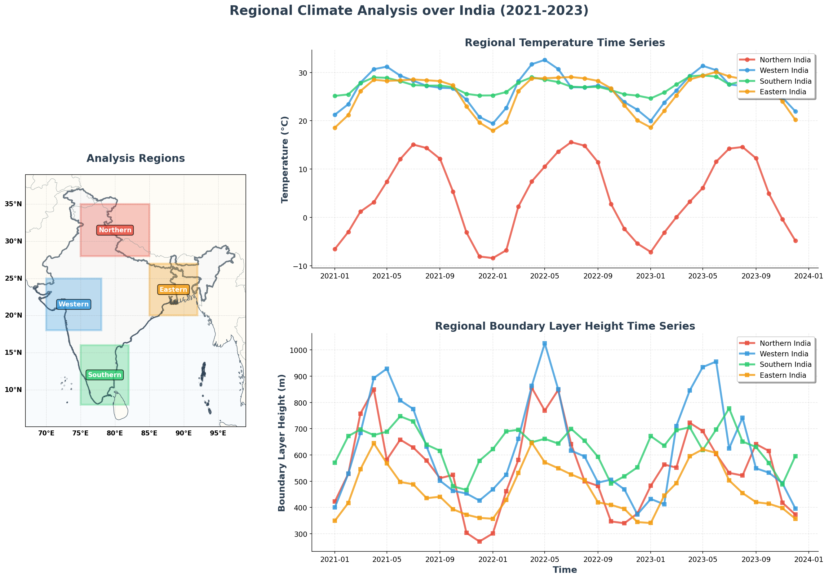
# Create regional time series visualization
fig = plt.figure(figsize=(22, 14), facecolor='white')
fig.suptitle('Regional Climate Analysis over India (2021-2023)',
fontsize=20, fontweight='bold', y=0.95, color='#2C3E50')
gs = fig.add_gridspec(2, 3, width_ratios=[1, 1, 1], height_ratios=[1, 1],
hspace=0.3, wspace=0.3)
# Regional map
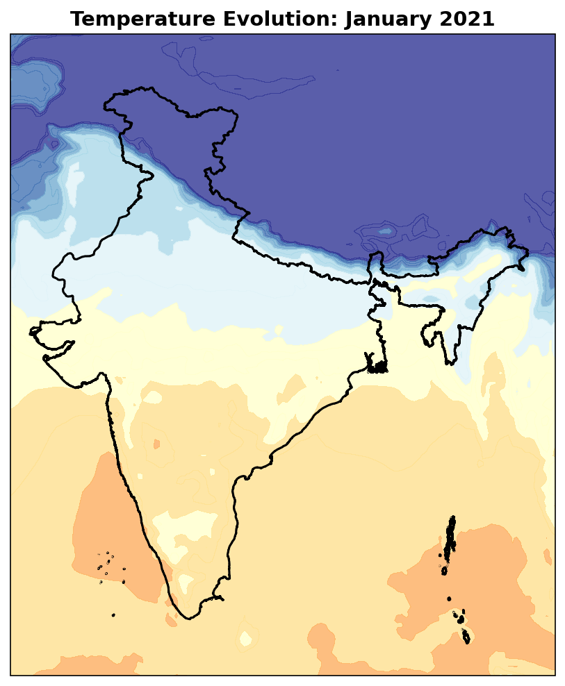
ax_map = fig.add_subplot(gs[:, 0], projection=ccrs.PlateCarree())
india_gdf.plot(ax=ax_map, facecolor='#F8F9FA', edgecolor='#2C3E50',
linewidth=2, transform=ccrs.PlateCarree(), alpha=0.7)
# Add regional rectangles
for region_name, bounds in regions.items():
rect = mpatches.Rectangle(
(bounds['lon_min'], bounds['lat_min']),
bounds['lon_max'] - bounds['lon_min'],
bounds['lat_max'] - bounds['lat_min'],
linewidth=3, edgecolor=bounds['color'], facecolor=bounds['color'],
alpha=0.3, transform=ccrs.PlateCarree()
)
ax_map.add_patch(rect)
# Add labels
center_lat = (bounds['lat_min'] + bounds['lat_max']) / 2
center_lon = (bounds['lon_min'] + bounds['lon_max']) / 2
ax_map.text(center_lon, center_lat, region_name.split()[0],
transform=ccrs.PlateCarree(), ha='center', va='center',
fontsize=10, fontweight='bold', color='white',
bbox=dict(boxstyle='round,pad=0.3', facecolor=bounds['color'], alpha=0.8))
setup_enhanced_plot_style(ax_map, 'Analysis Regions')
# Temperature time series
ax_temp = fig.add_subplot(gs[0, 1:])
for region_name, temp_data in regional_temp.items():
time_values = temp_data[temp_time_coord]
color = regions[region_name]['color']
ax_temp.plot(time_values, temp_data.values, marker='o', linewidth=3,
markersize=6, label=region_name, color=color, alpha=0.8)
ax_temp.set_ylabel('Temperature (°C)', fontsize=14, fontweight='bold', color='#2C3E50')
ax_temp.set_title('Regional Temperature Time Series', fontsize=16, fontweight='bold', color='#2C3E50')
ax_temp.legend(loc='upper right', frameon=True, fancybox=True, shadow=True, fontsize=11)
ax_temp.grid(True, alpha=0.3, linestyle='--')
ax_temp.spines['top'].set_visible(False)
ax_temp.spines['right'].set_visible(False)
# PBLH time series
ax_pblh = fig.add_subplot(gs[1, 1:])
for region_name, pblh_data in regional_pblh.items():
time_values = pblh_data[pblh_time_coord]
color = regions[region_name]['color']
ax_pblh.plot(time_values, pblh_data.values, marker='s', linewidth=3,
markersize=6, label=region_name, color=color, alpha=0.8)
ax_pblh.set_ylabel('Boundary Layer Height (m)', fontsize=14, fontweight='bold', color='#2C3E50')
ax_pblh.set_xlabel('Time', fontsize=14, fontweight='bold', color='#2C3E50')
ax_pblh.set_title('Regional Boundary Layer Height Time Series', fontsize=16, fontweight='bold', color='#2C3E50')
ax_pblh.legend(loc='upper right', frameon=True, fancybox=True, shadow=True, fontsize=11)
ax_pblh.grid(True, alpha=0.3, linestyle='--')
ax_pblh.spines['top'].set_visible(False)
ax_pblh.spines['right'].set_visible(False)
plt.tight_layout()
plt.show()